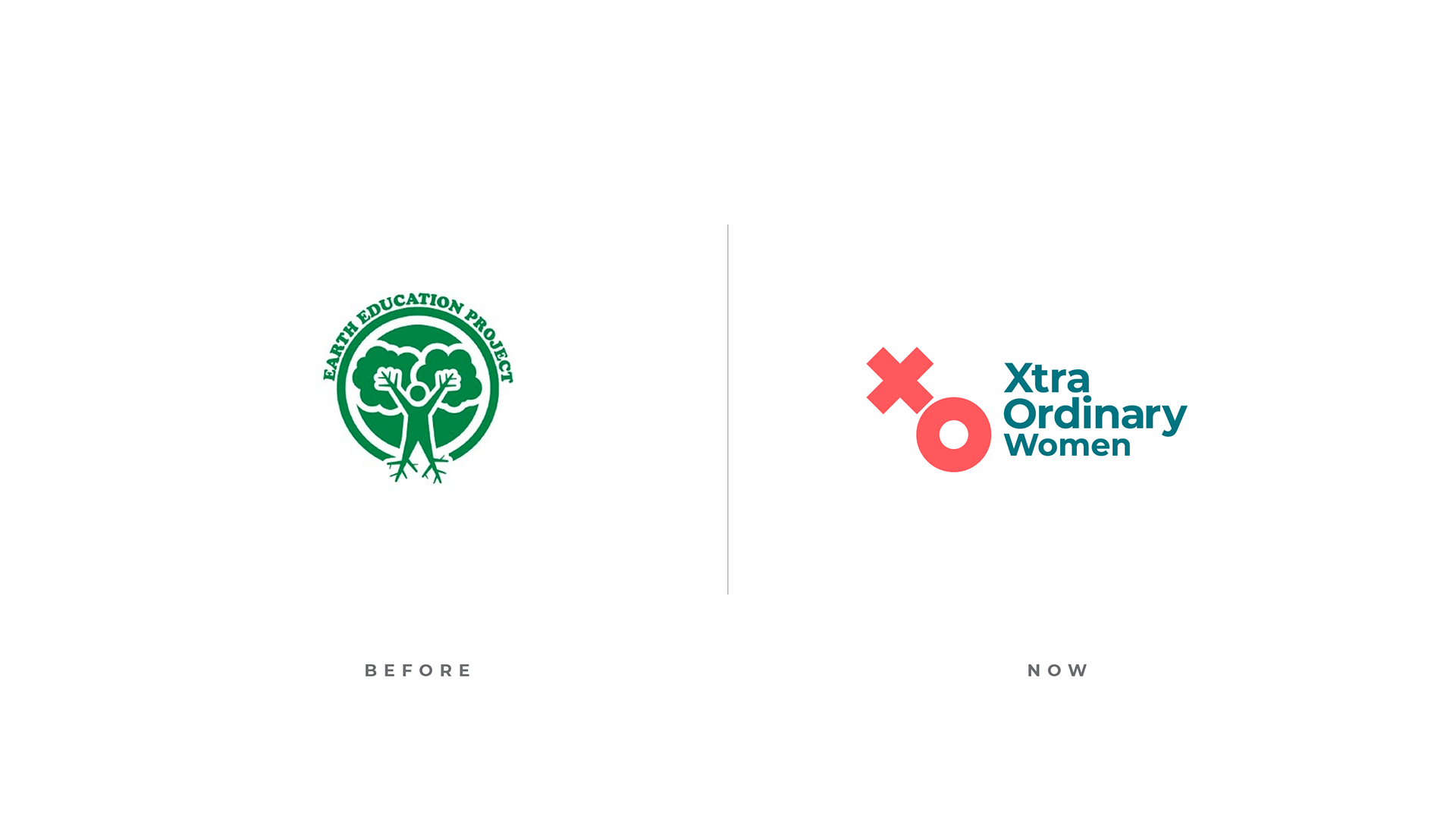
For their 10th Anniversary, 'Earth Education Project' became the mighty 'XtraOrdinary Women.' Taking the participants into account, the brand was conceived as bilingual. As a result, they could now pronounce the organization's name: 'Mujeres XtraOrdinarias.' The rebranding gave participants a new level of confidence and reaffirmed how extraordinary they are.
Breaking the cycle
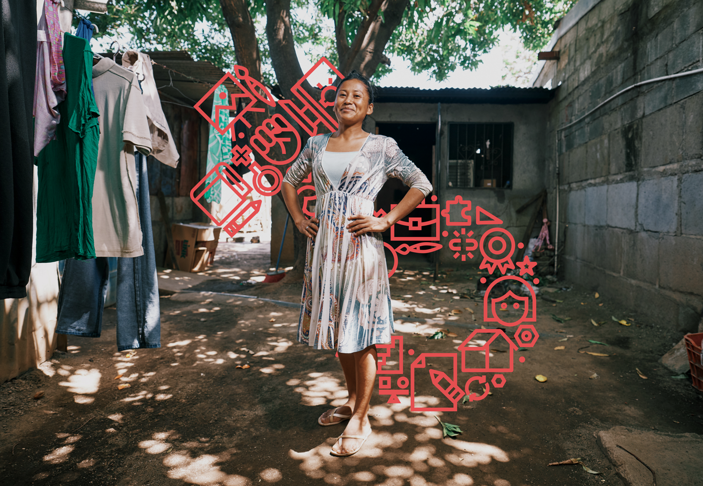
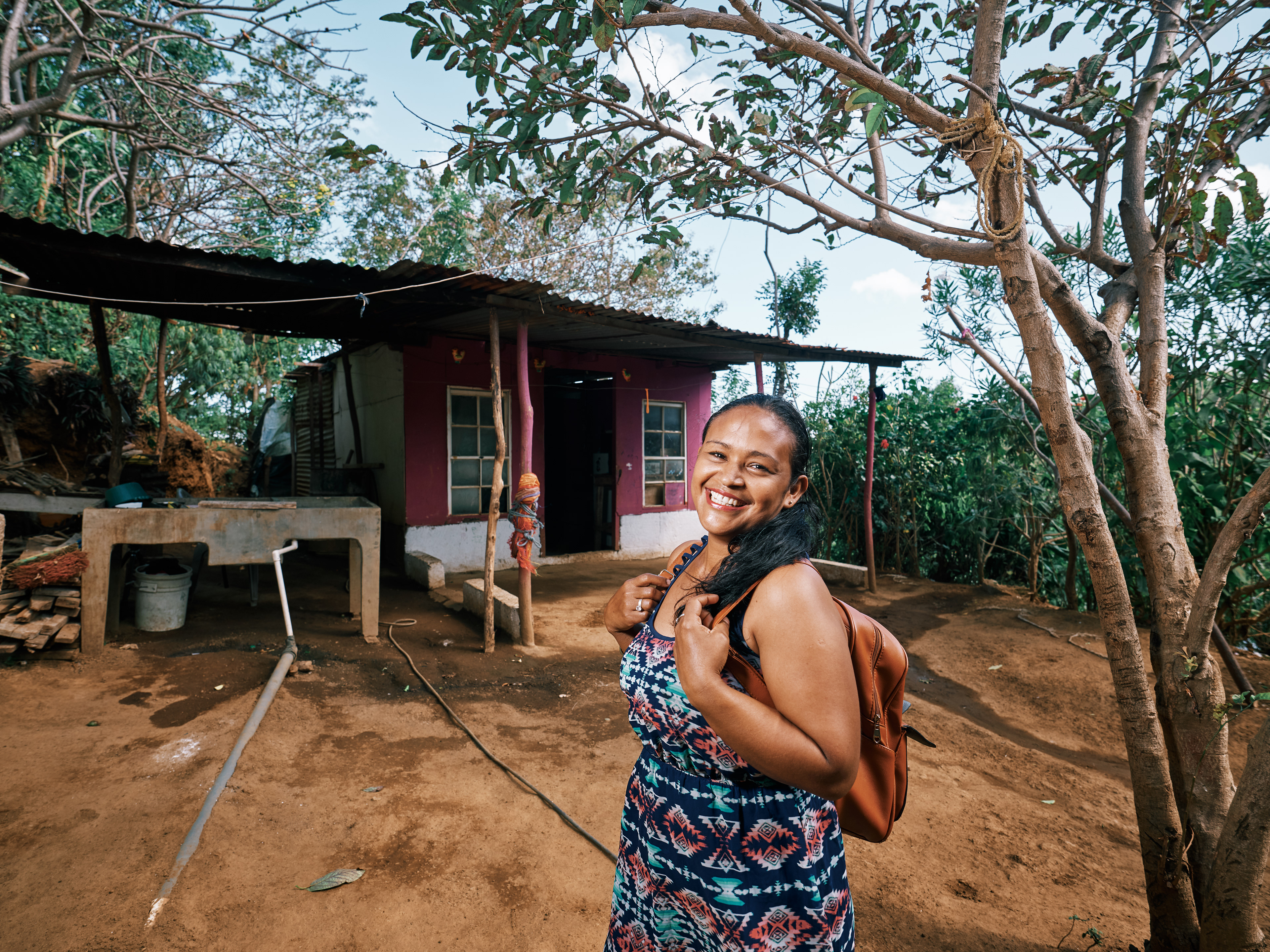
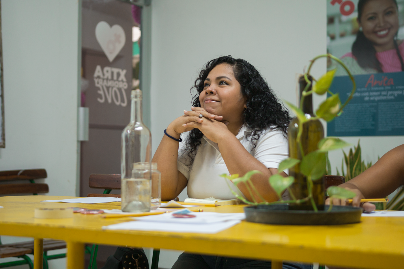
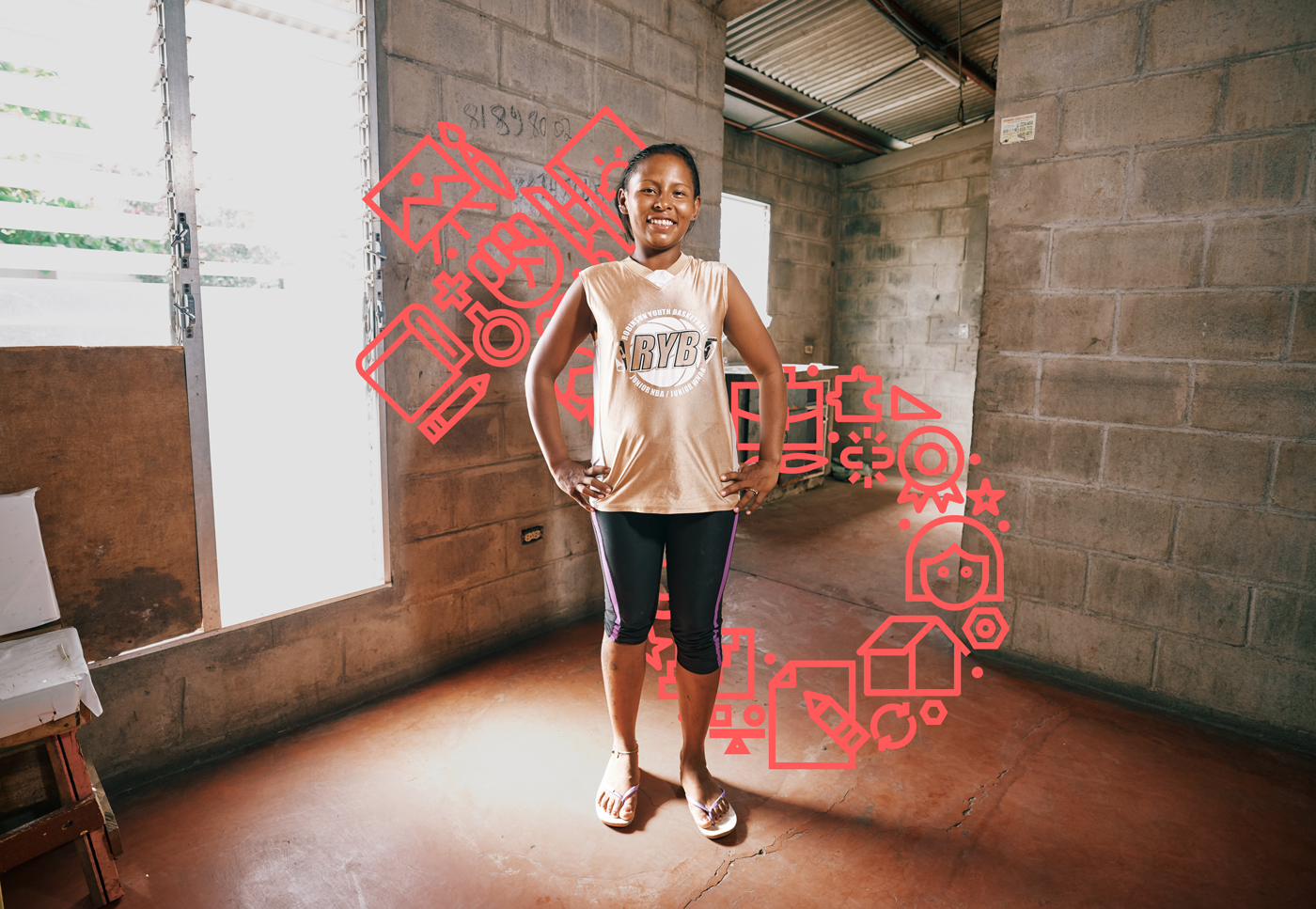
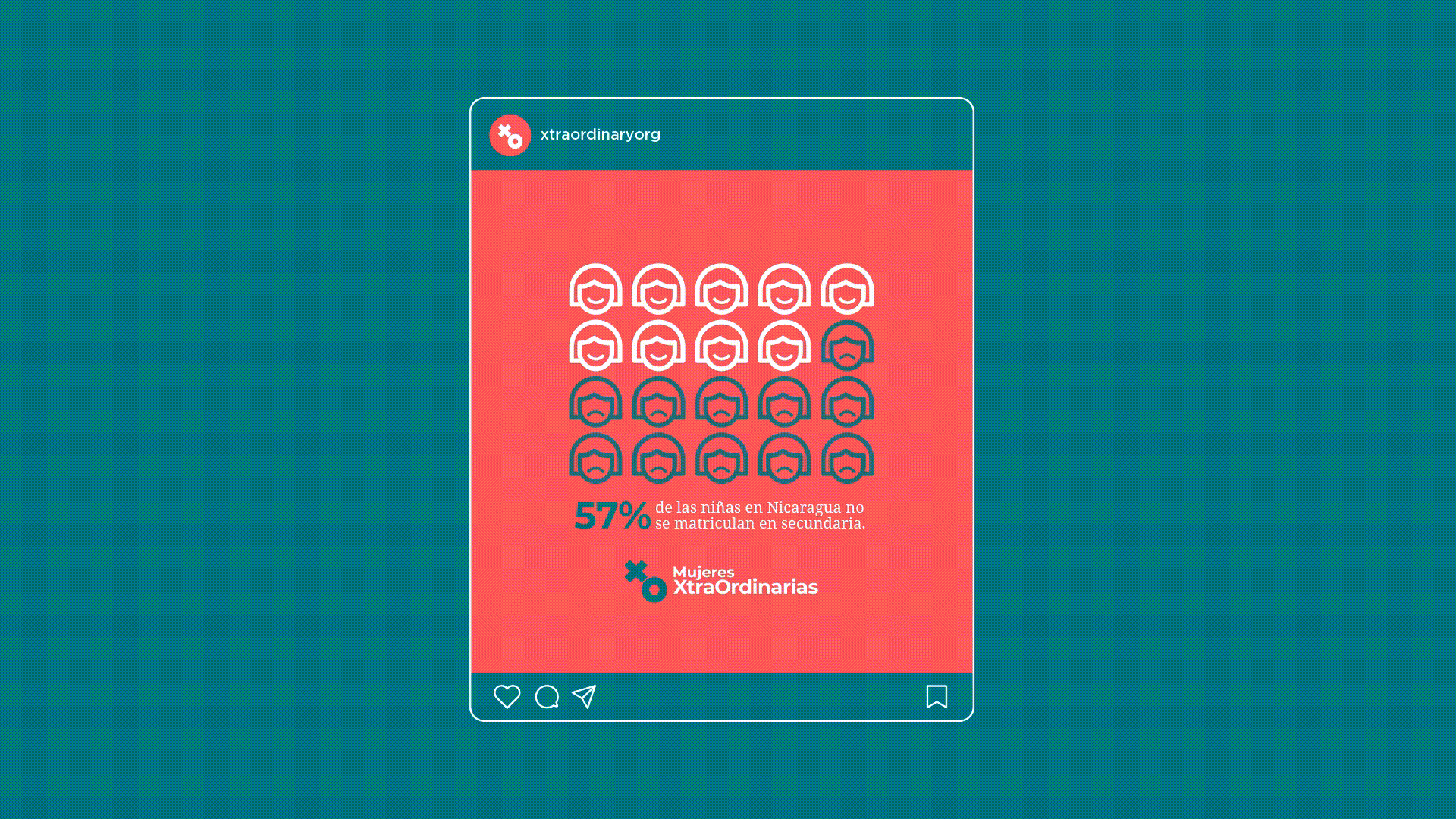
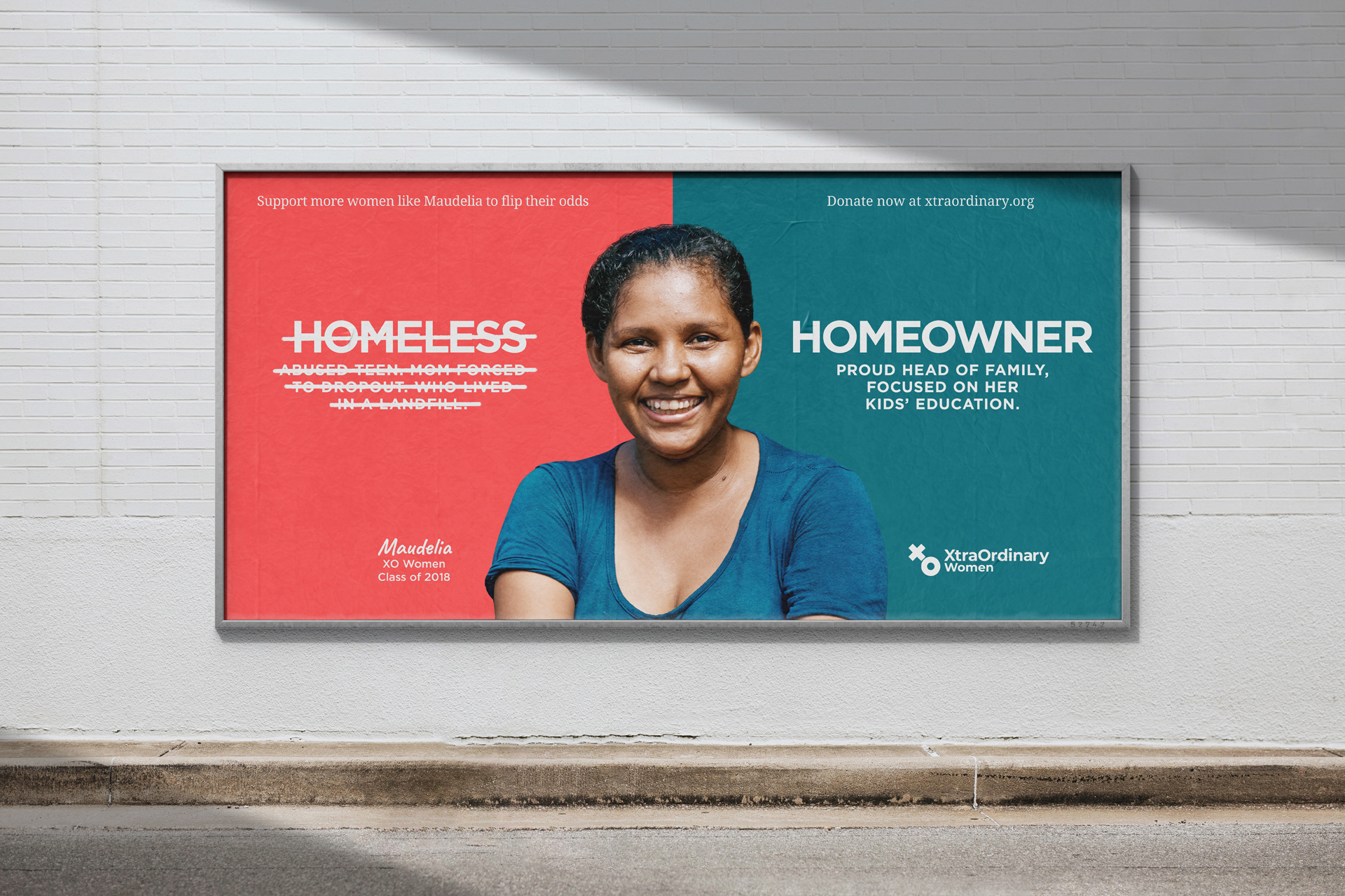
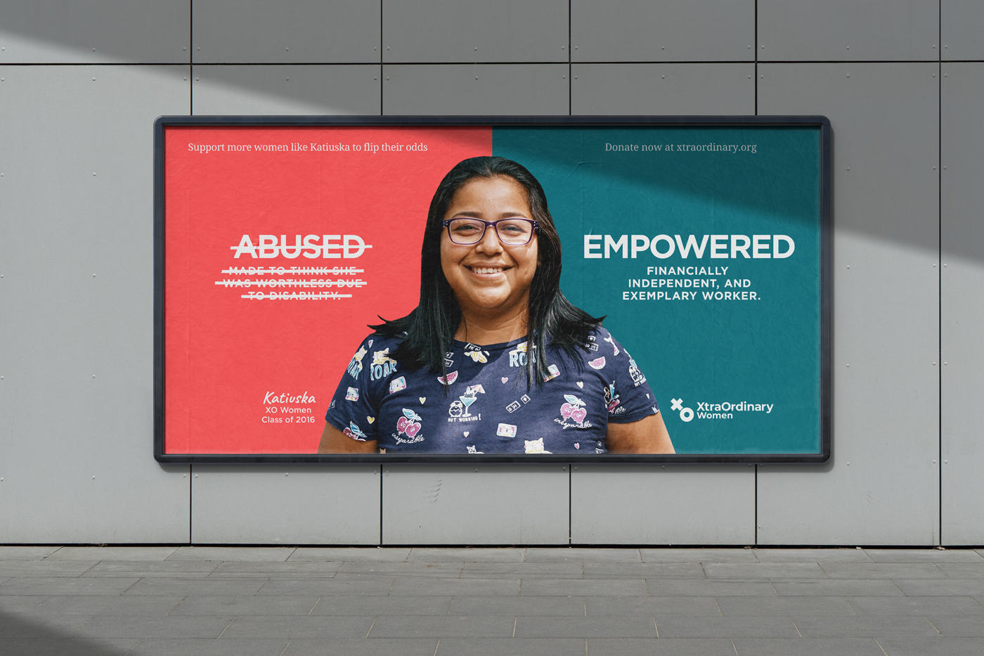
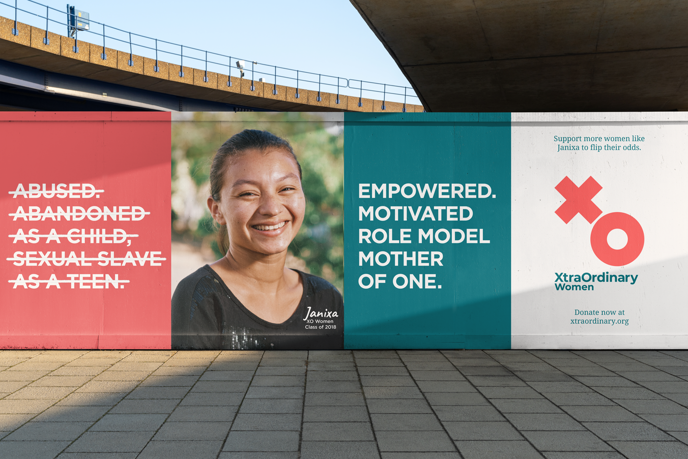
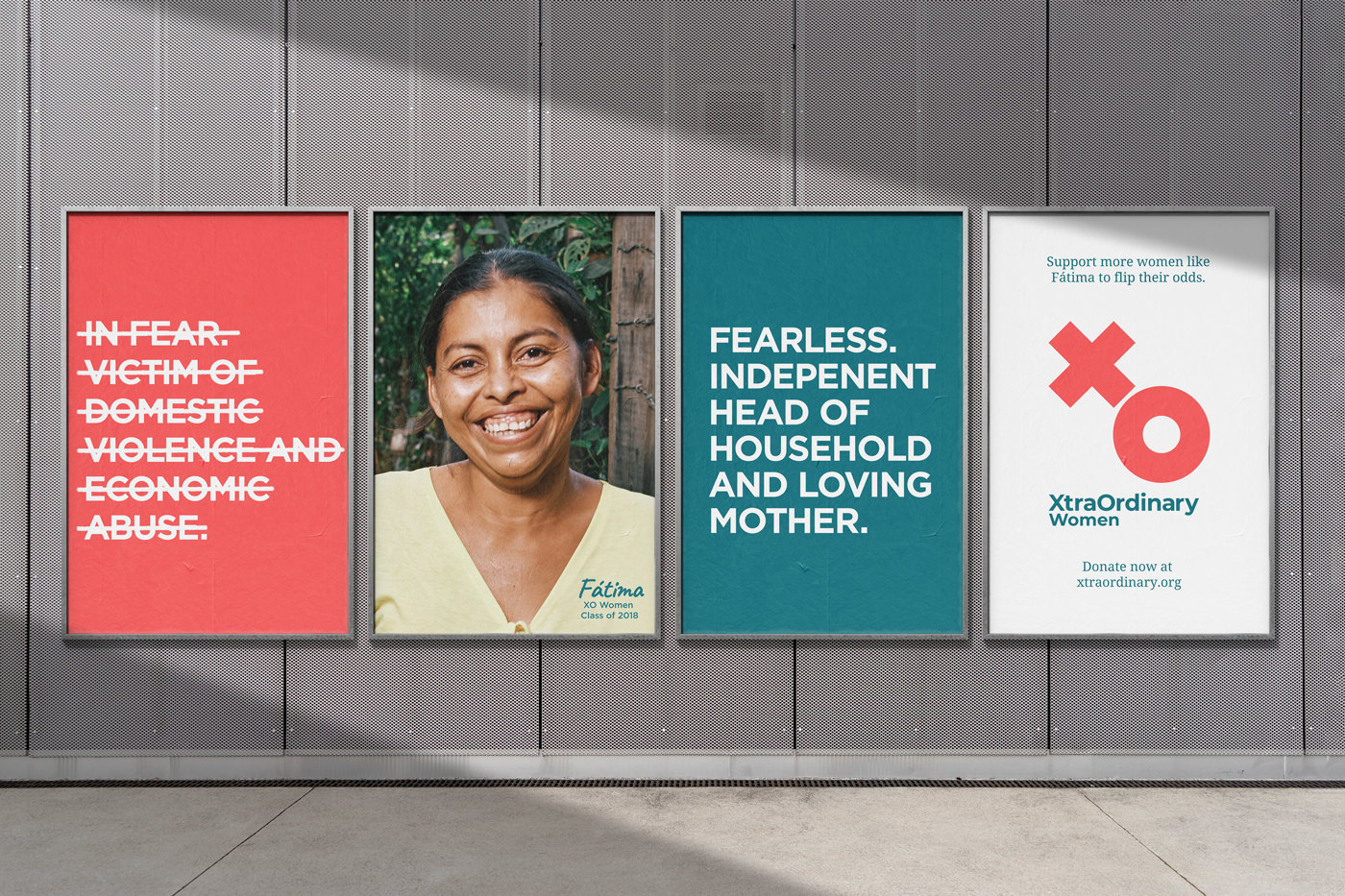
Participants join XtraOrdinary Women for a chance to break the cycle of extreme poverty and violence most of them were born into. After a thorough brief on the organization's history and a decade of work, we understood that the foundation for sustainable behaviour change was the empowerment that they provided these women with, enabling them to flip their odds.
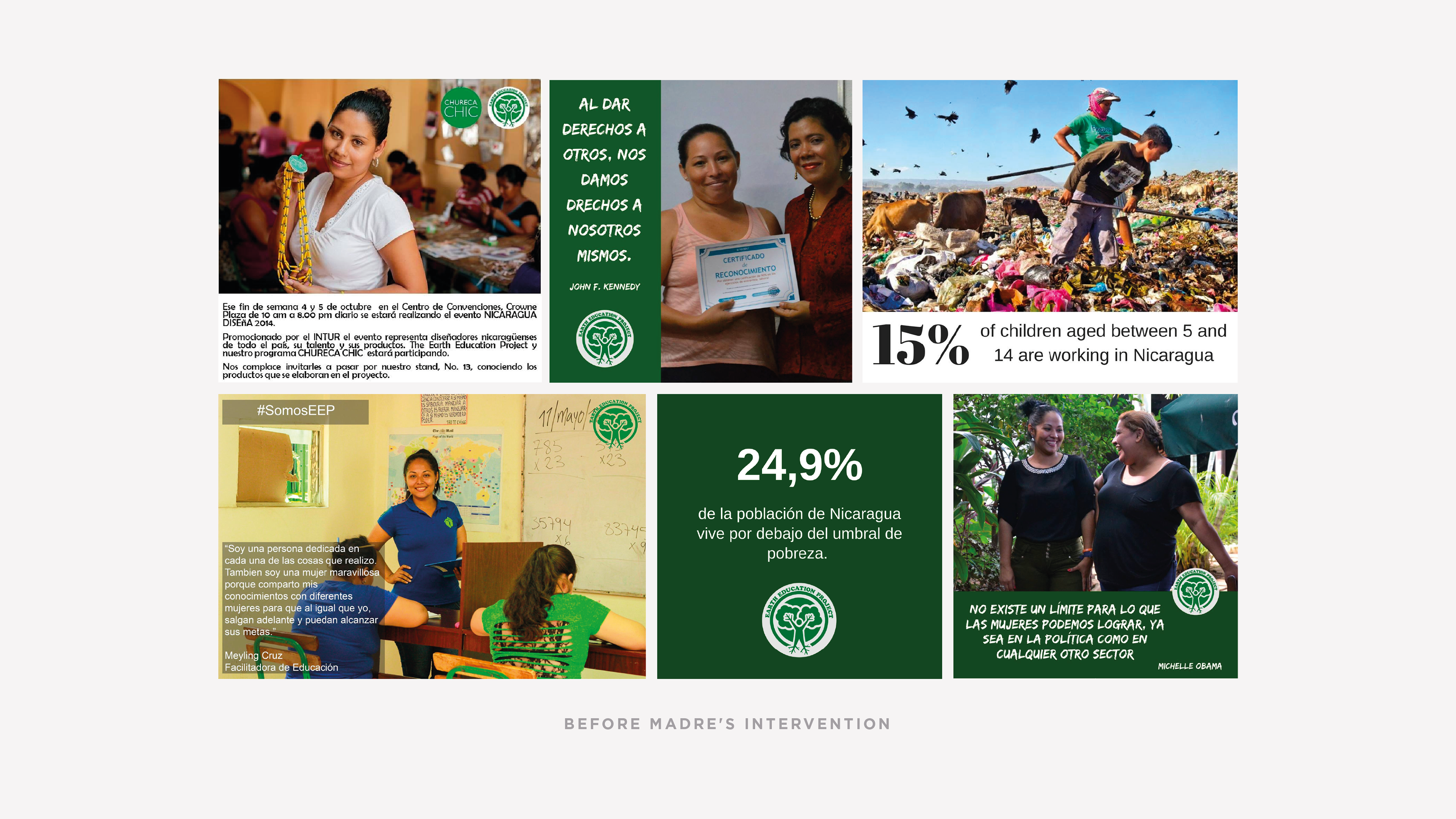
That has been the case for more than 1700 successful program graduates, positively changing more than 5000 lives.From then on, we crafted a new manifesto and positioning statement and revamped the vision and values. Next, we refined the brand's voice making it all about cheerleading women, reaffirming the organization's commitment to education and equal opportunities for women.
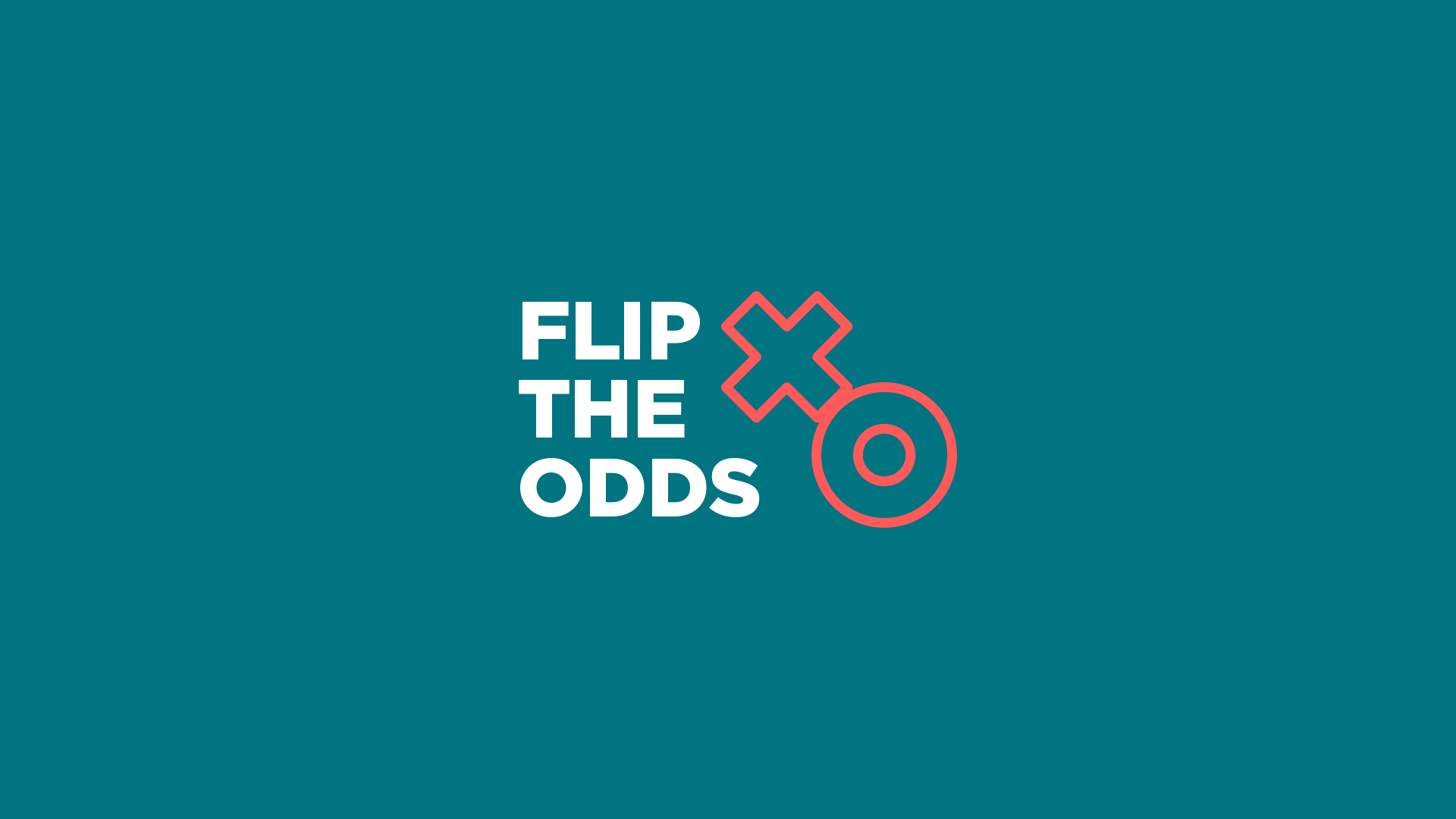
Flip the odds
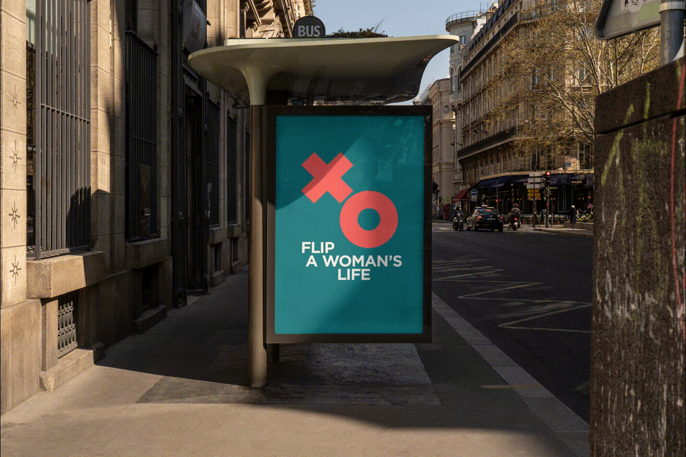
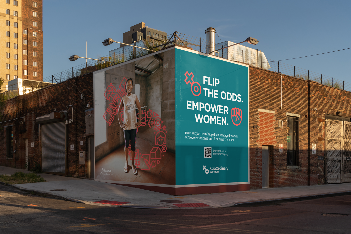
We believe the right opportunity can change a woman’s life and the lives around her. Therefore, we empower women through skill training, psychosocial support, and job placement programs. We help them flip the odds and break the cycle of extreme poverty and domestic violence in exchange for a brighter, happier, self-sustainable future.


Empowering Identity
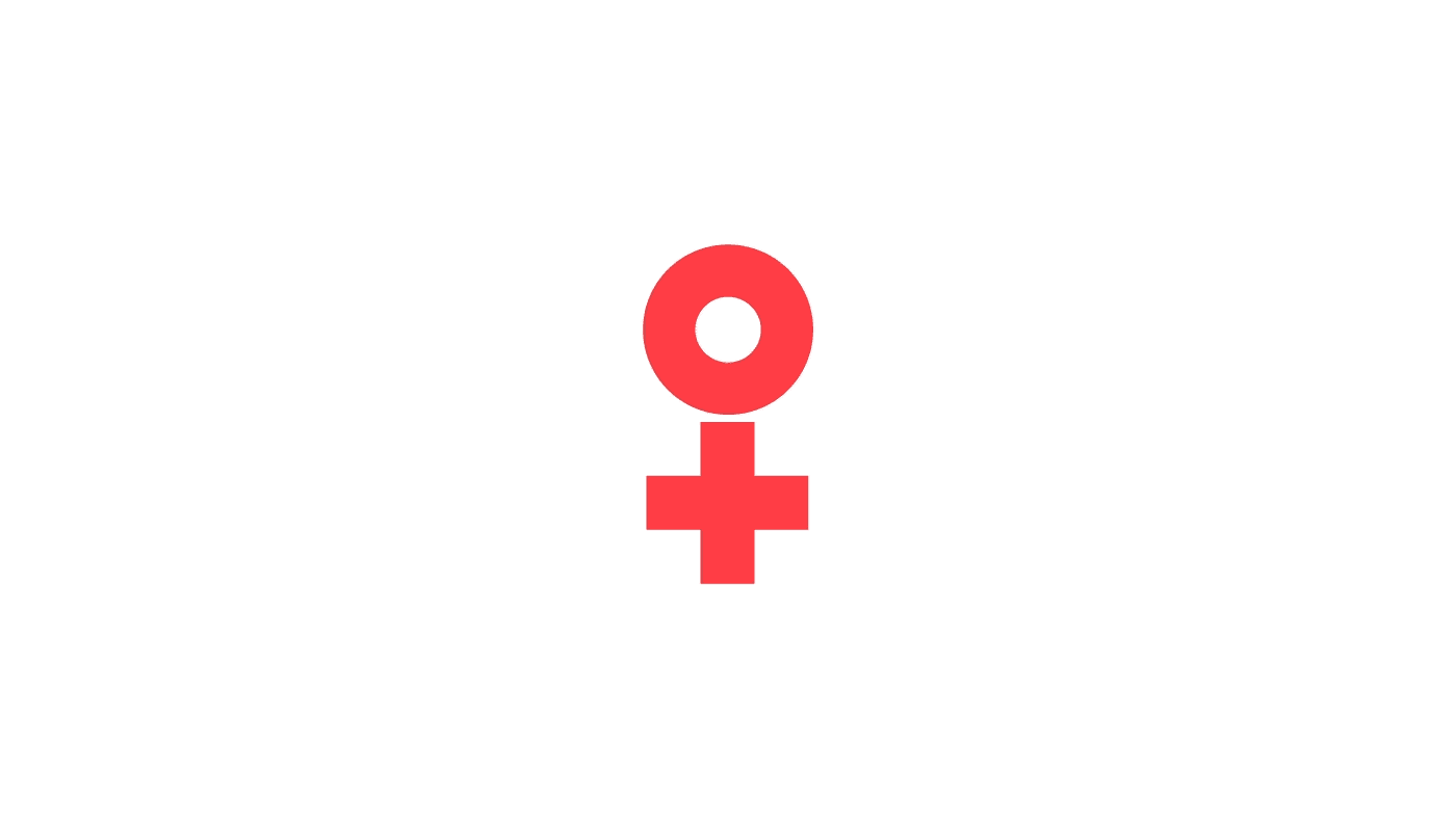
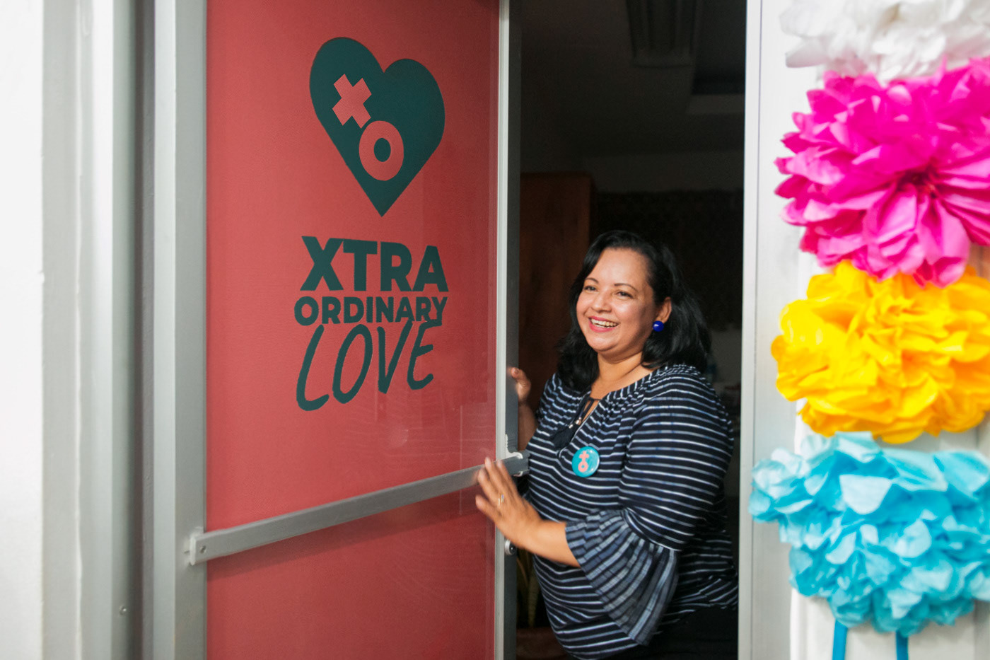
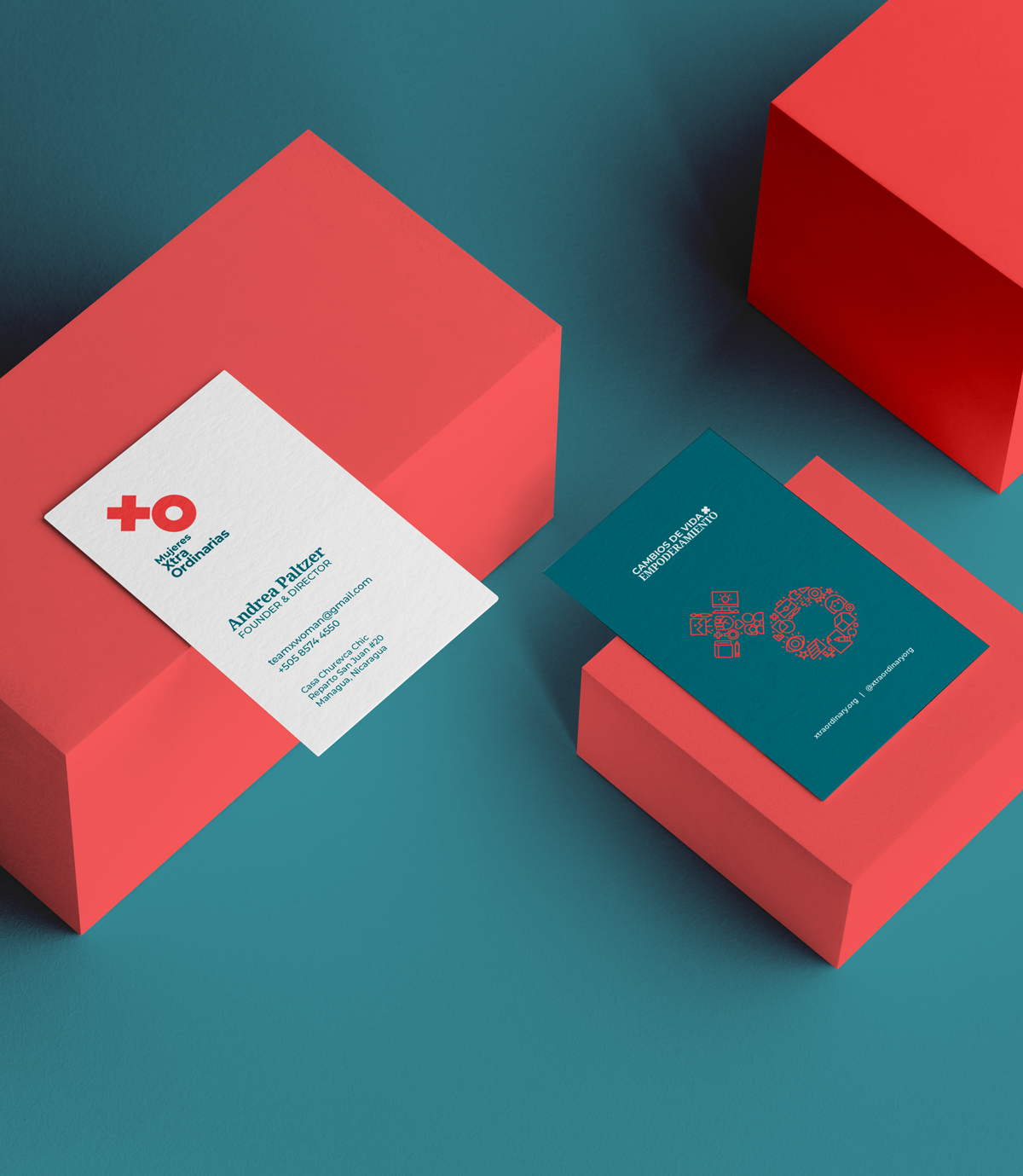
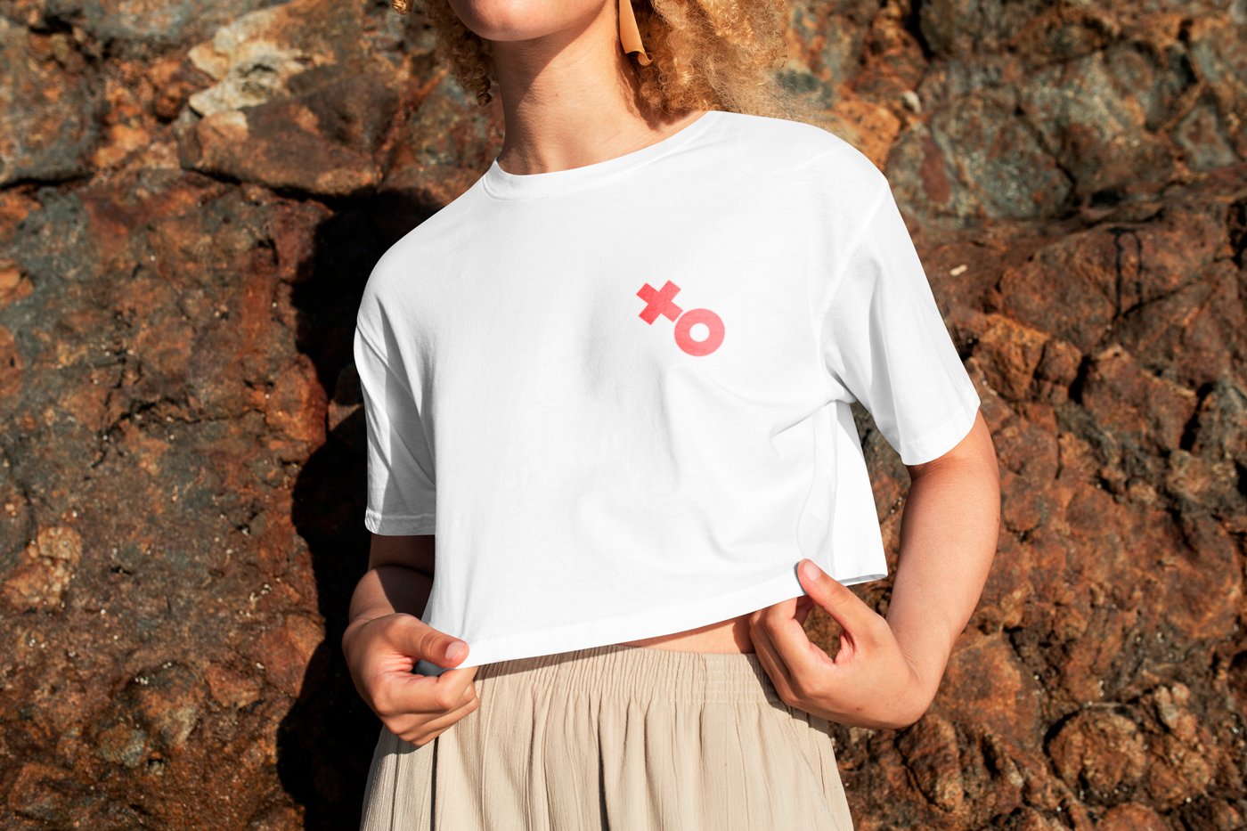
The original visual brand identity lacked engagement and recognition. With the new identity, we could excite institutional donors, make it cool to support allies, and, most importantly, make it attractive and easy to understand for participants. For the brand mark, we took a simple but powerful sign, the iconic female symbol ♀, and literally flipped the odds for this NGO.
For the chromatic palette, we selected coral and teal. Cool and trendy colours that have a feminine aspect to them but aren't stereotypical. Together, they create a visually fresh and dynamic look that reinforces the idea of a better future.
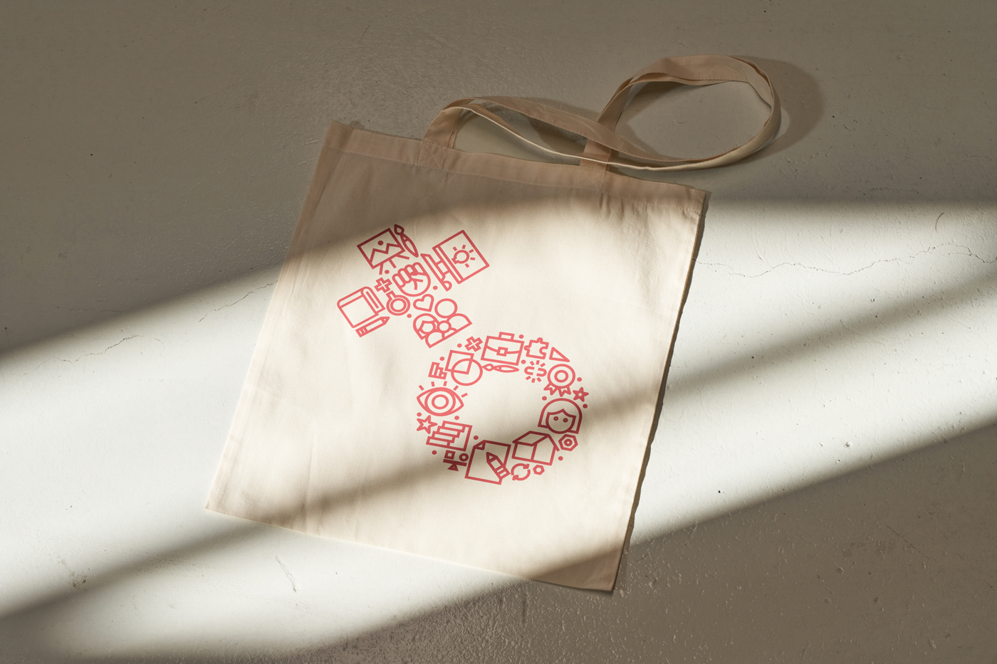
We equipped the XOW team with all the tools they’d need to take ownership of their remarkable story. These included new assets such as Montserrat, Noto Serif, and Caveat typefaces, high-impact duotone treatments for their photographs, a new set of icons representing their services and values, and cool text lockups for their key messages.

Creative and Strategic Direction: Carlos Zúñiga.
Lead Designer: Andrea López
Graphic Design: Andrea López, Carlos Zúñiga, Melina Rodríguez, Daniel Aragón.
Copy and Communications: Daniel Aragón, Paola Zúniga.
Field Photography: Otto Mejía Photography
Developed by Madre Consulting for XtraOrdinary Women © 2019
Lead Designer: Andrea López
Graphic Design: Andrea López, Carlos Zúñiga, Melina Rodríguez, Daniel Aragón.
Copy and Communications: Daniel Aragón, Paola Zúniga.
Field Photography: Otto Mejía Photography
Developed by Madre Consulting for XtraOrdinary Women © 2019