STRATEGY. CREATIVITY. DESIGN. COMMUNICATIONS. UX. UI.
Nurturing a health tech brand on its way to becoming LATAM's most robust well-being app.
In a world of emerging new technologies and global pandemics, the digital health industry is experiencing unprecedented growth and a dose of scepticism, especially in more traditional markets like LATAM. In this context, how do you get people on board with your SaaS product? That's the challenge Goctors, an Ecuador-based health tech startup, faced.
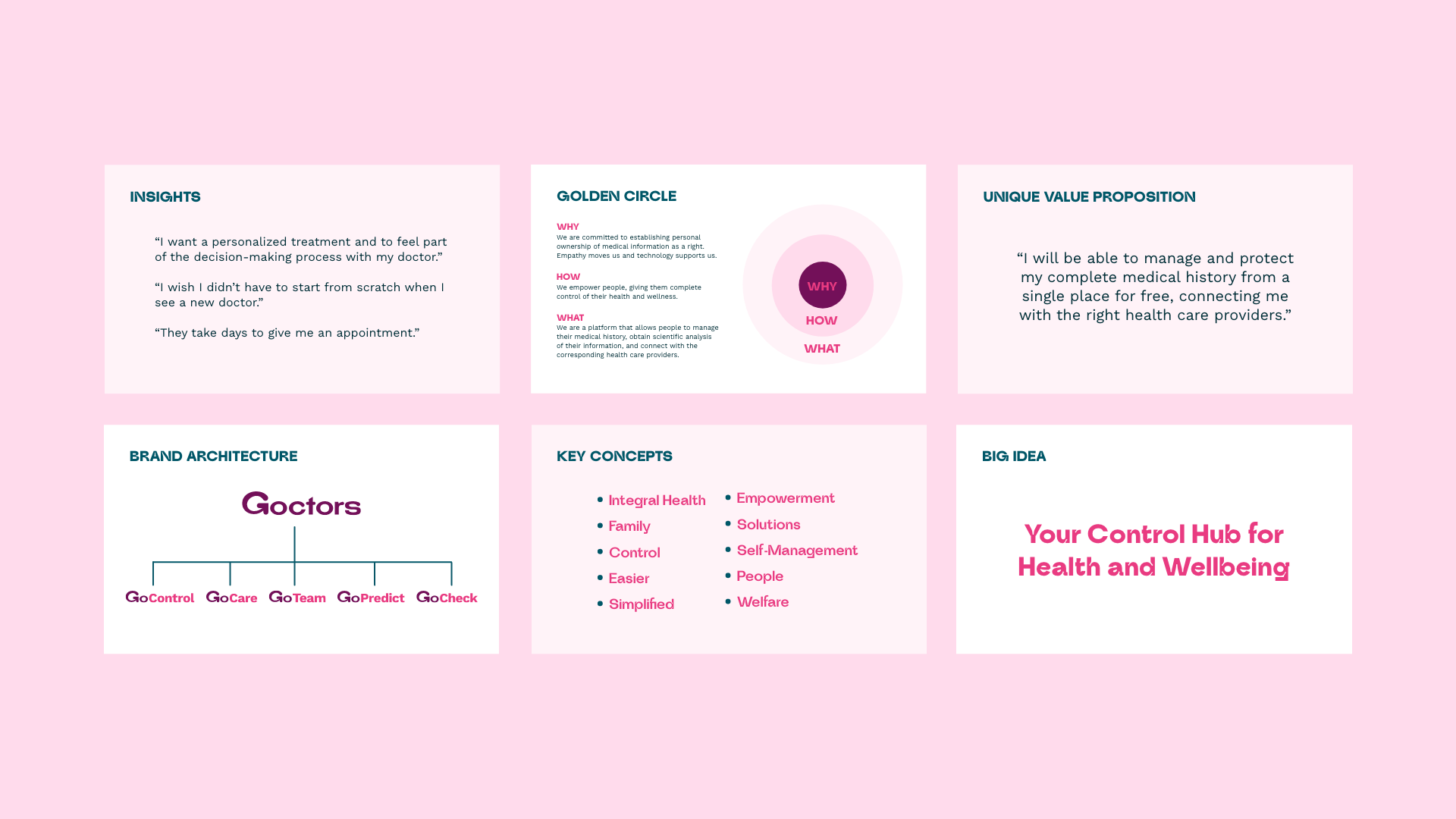
Since its foundation, Goctors has had the mission of giving patients ownership of their complete health information and connecting all the actors in the health ecosystem through a united channel. Still, their message was unclear because of its complexity, and their value proposition wasn't coming across. Therefore, they invited us to help build a brand strategy that communicated who they are and what they do in a relevant way for their desired audience.
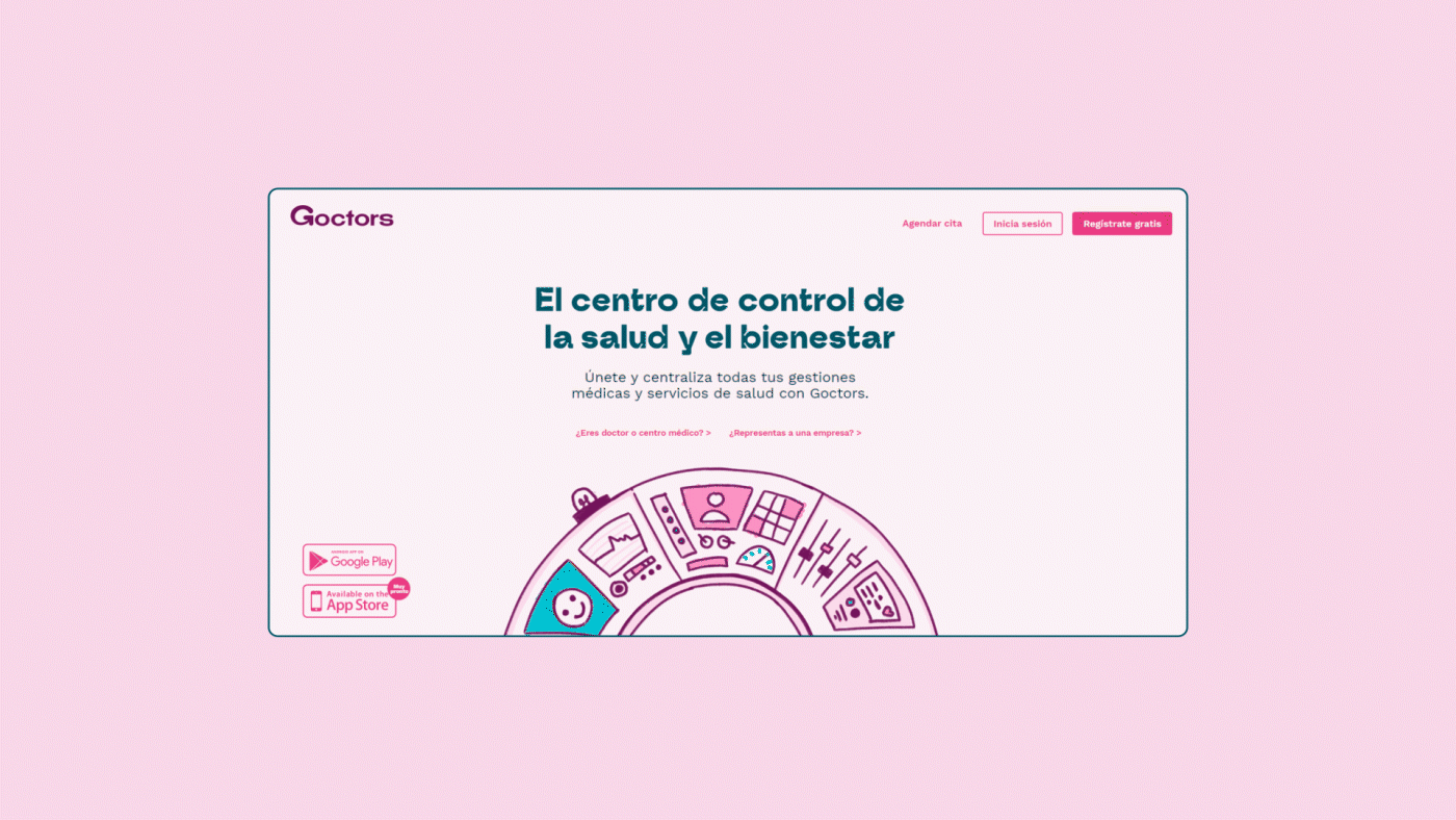
The control hub for health and wellbeing
We started by appreciating the project's potential, unveiling its differentiating factors, and clarifying its offer.
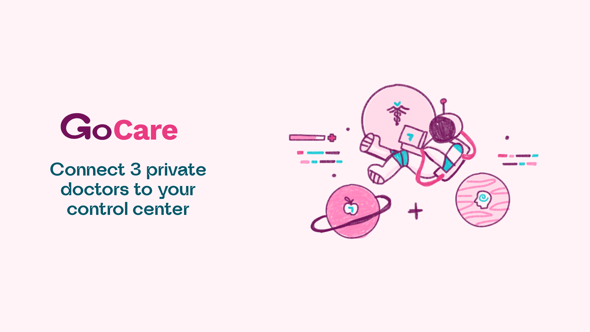
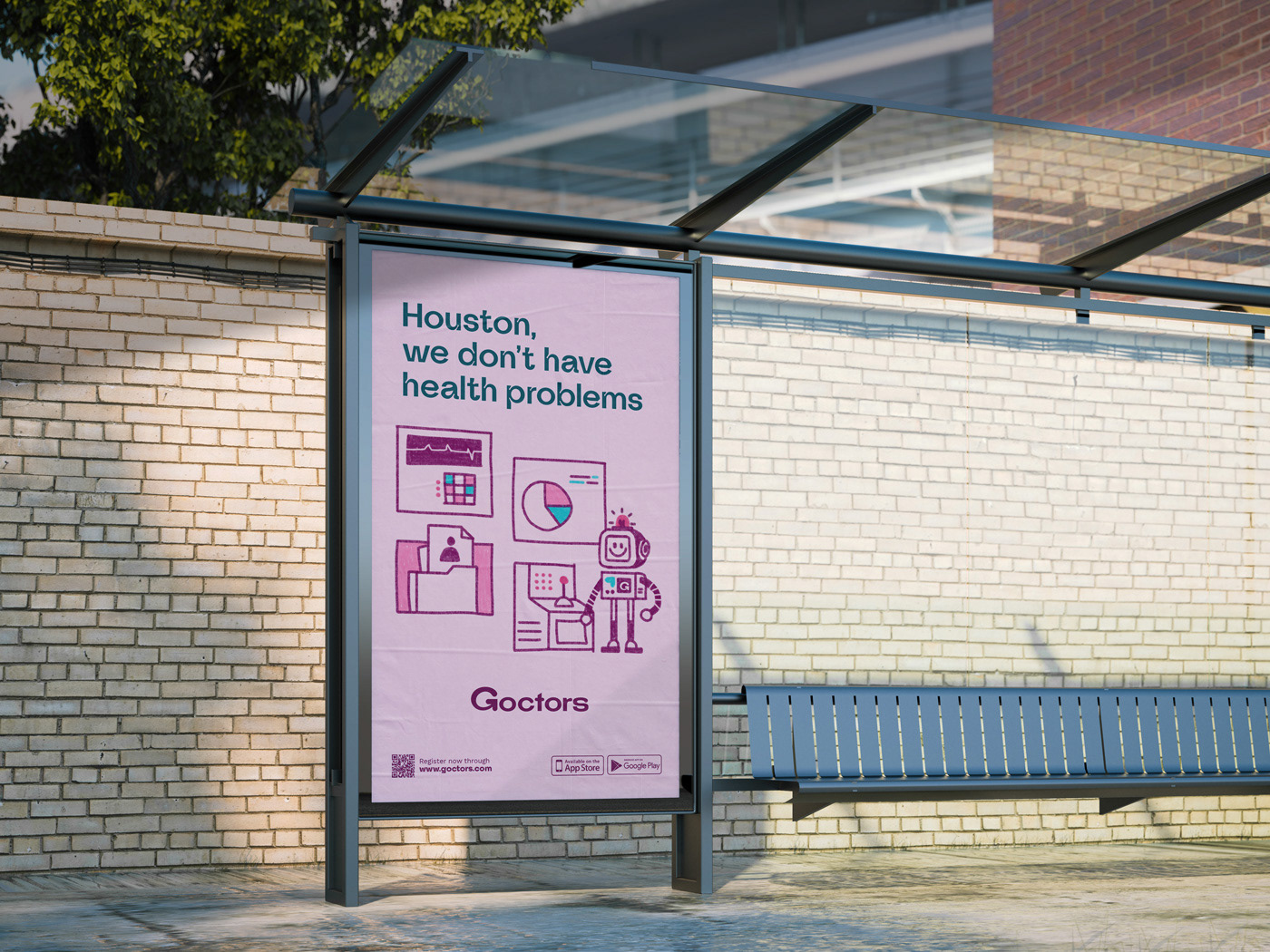
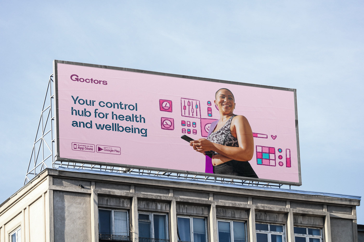
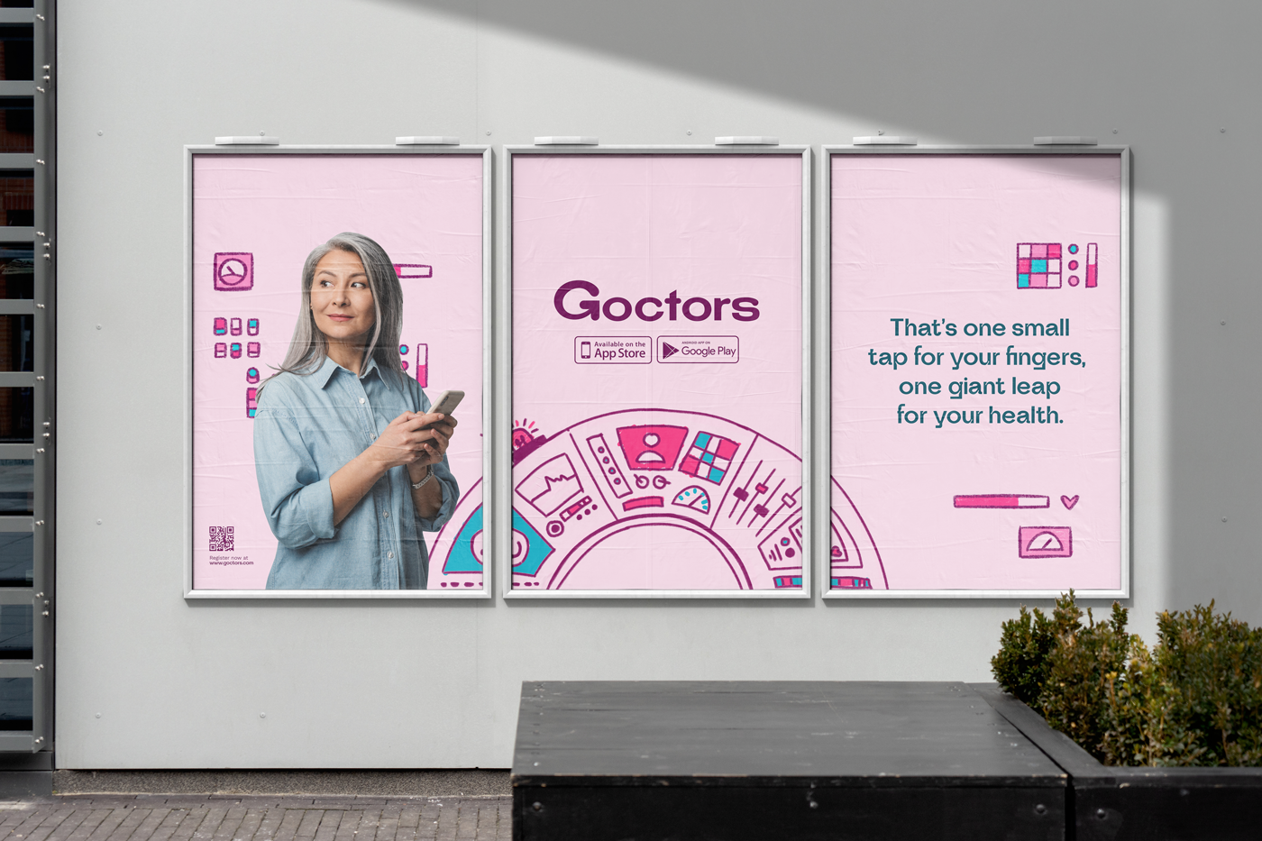
This process led us to craft the brand's leading Big Idea: "The Control Hub for Health and Wellbeing." This powerful concept clarifies the benefit that Goctors provides: having the ultimate all-in-one digital health tool at your fingertips.
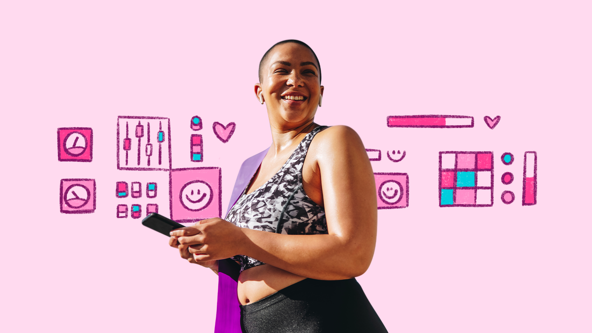
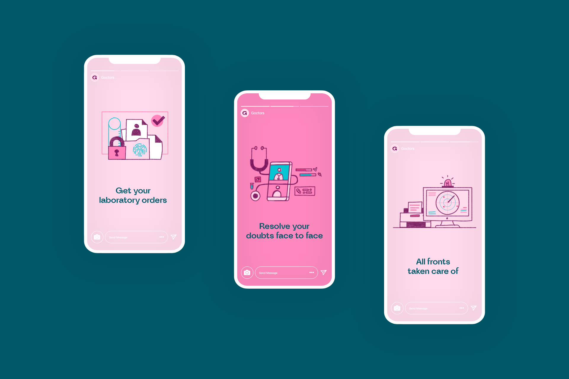
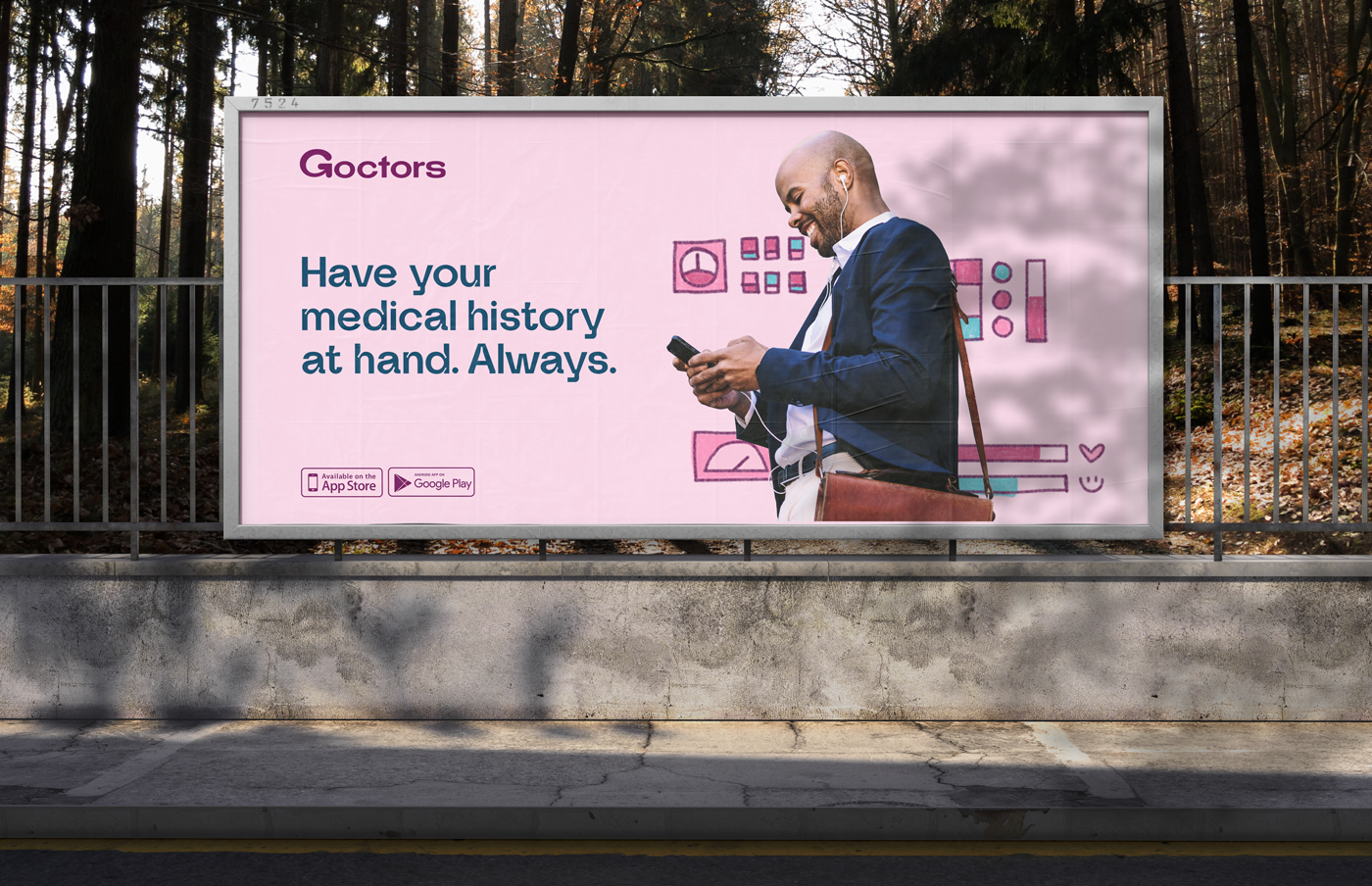
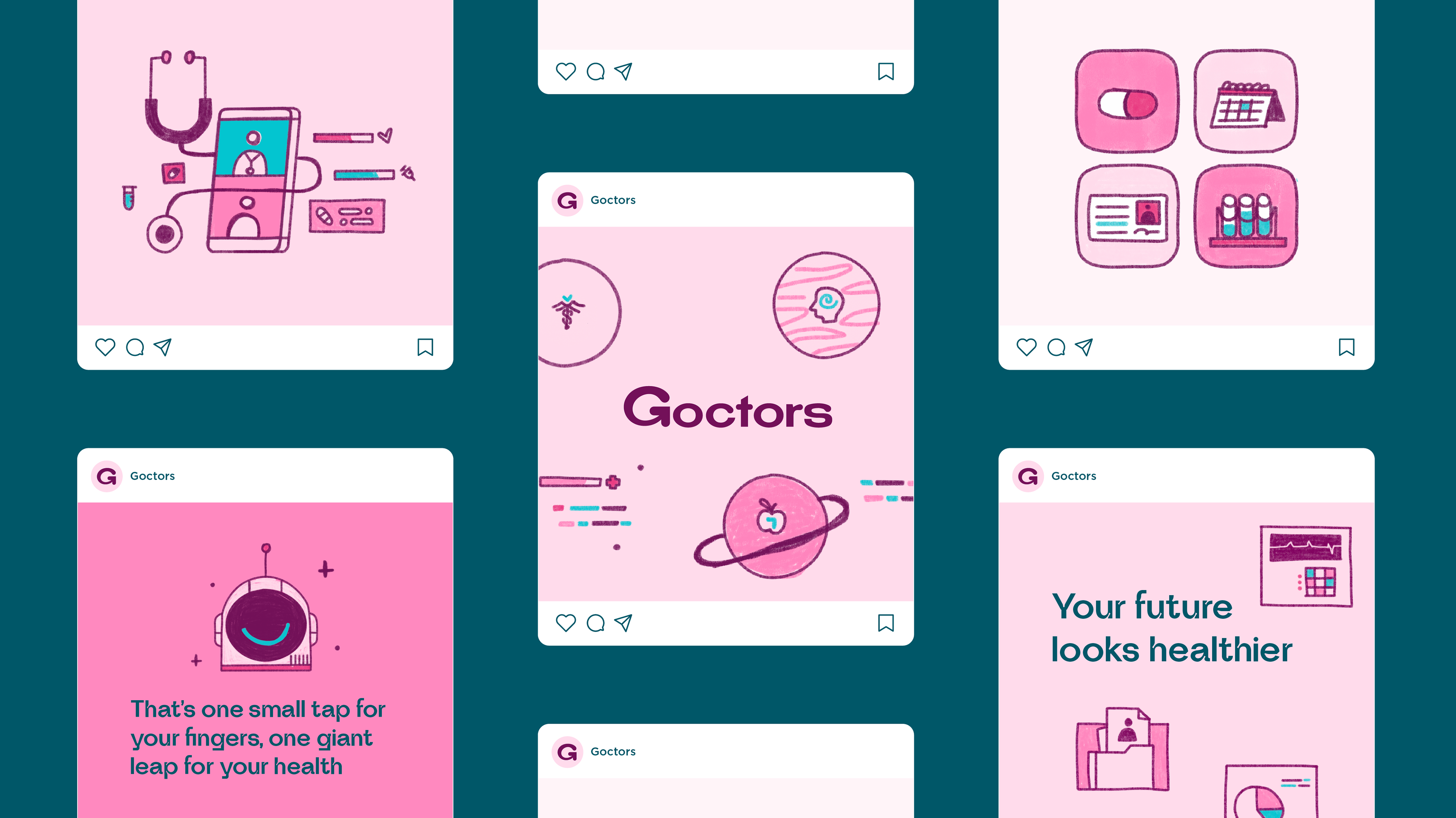
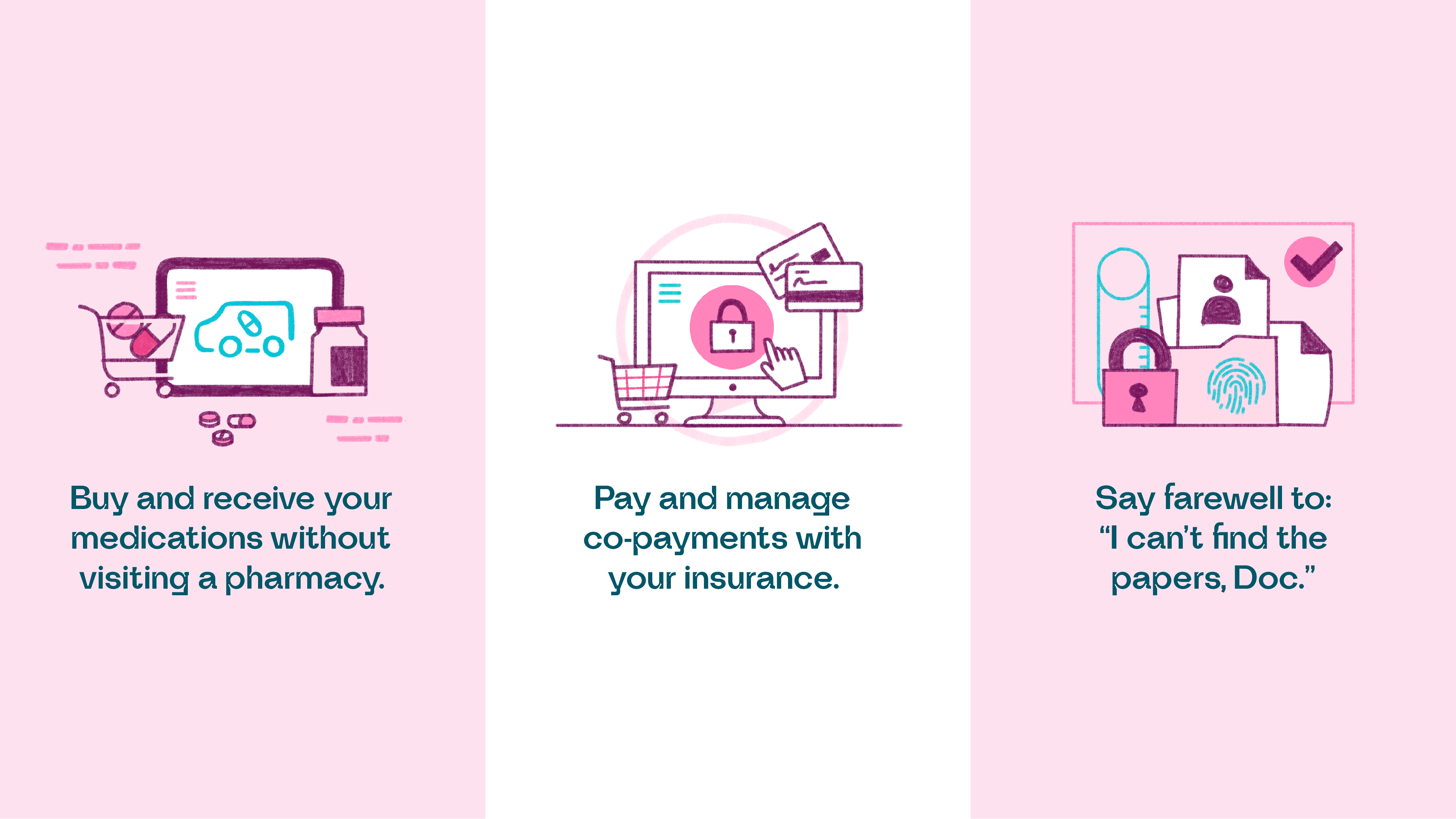
Goctors' mobile application and website allow people to manage their medical history, obtain scientific information analysis and connect directly with the services and health specialists that best suit them.
With clarity in the offer and a big idea, our team created a new brand identity system and communications strategy.
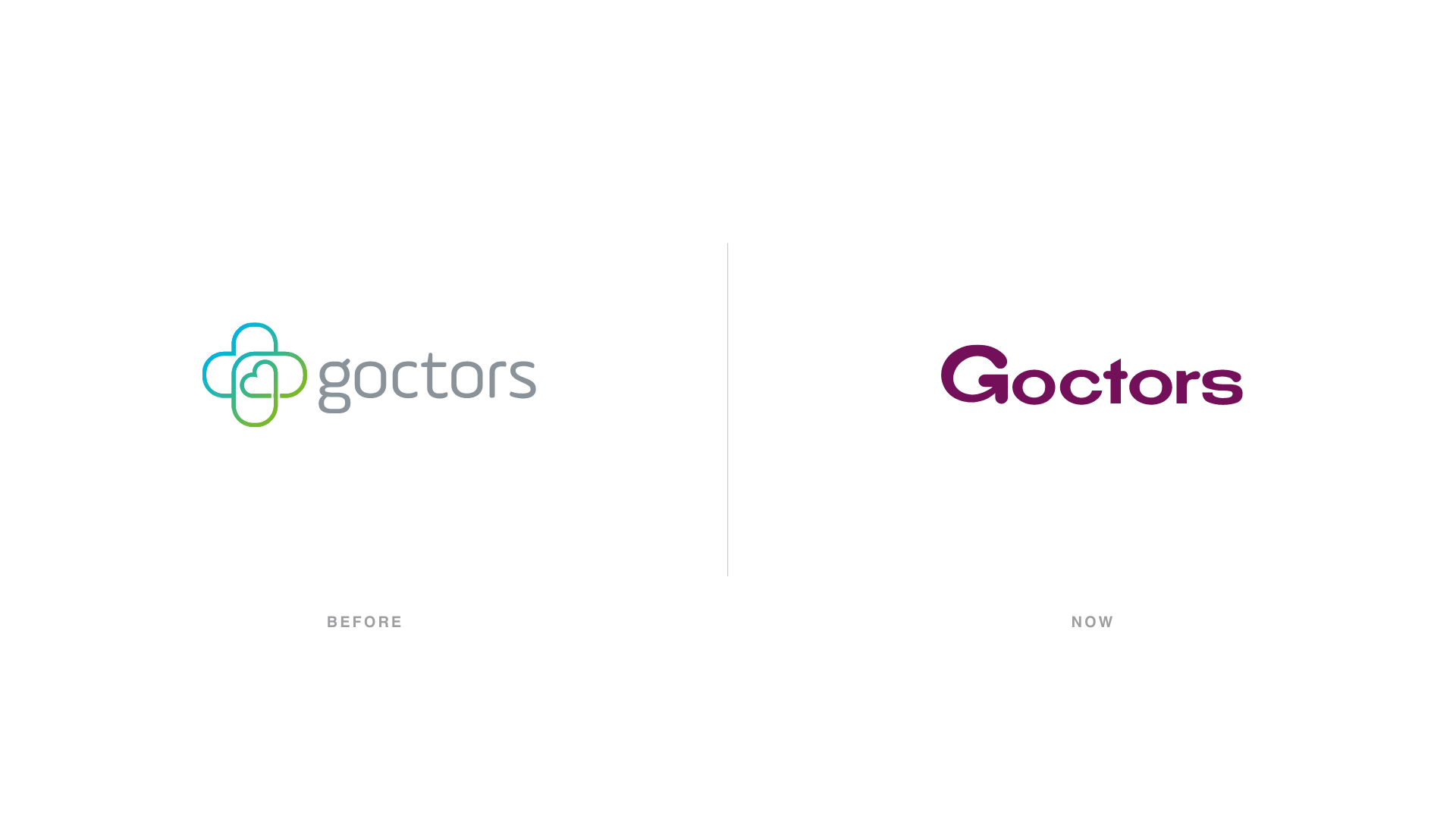
An identity moved by empathy.
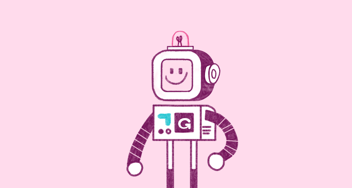
The logo uses a simple type with a twist, successfully striking a balance between the formality and heart that the brand needs. The isotype is a distinctive G with a heart, a universal symbol for good health that reflects the brand's empathy and the constant quest to positively transform the human experience with healthcare services, putting people first.
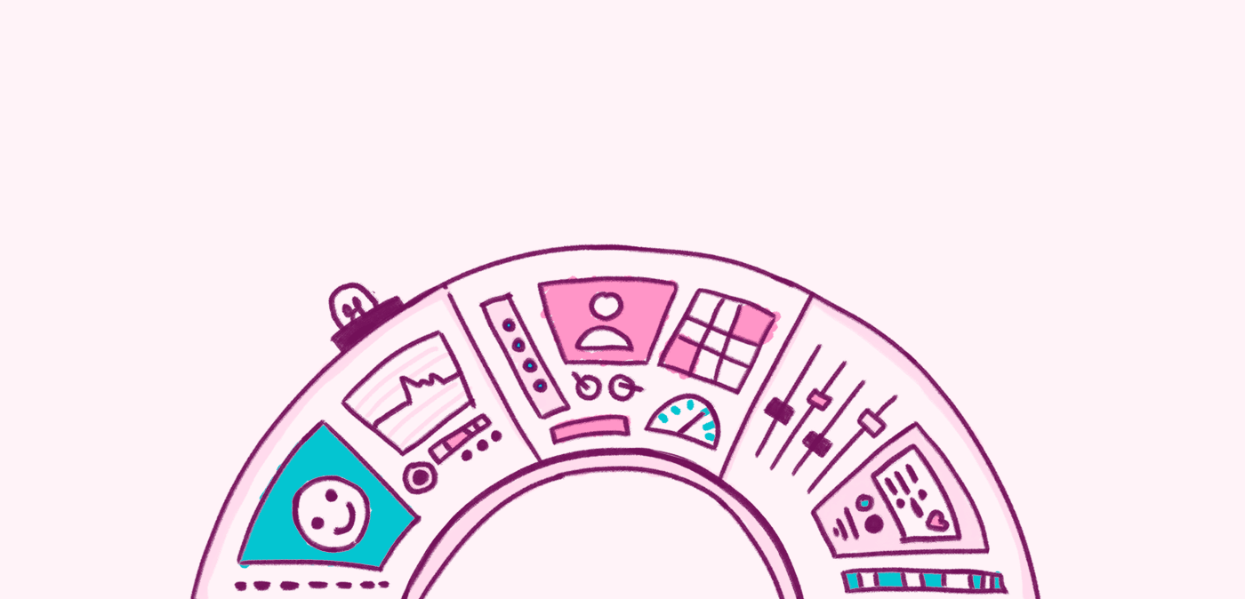
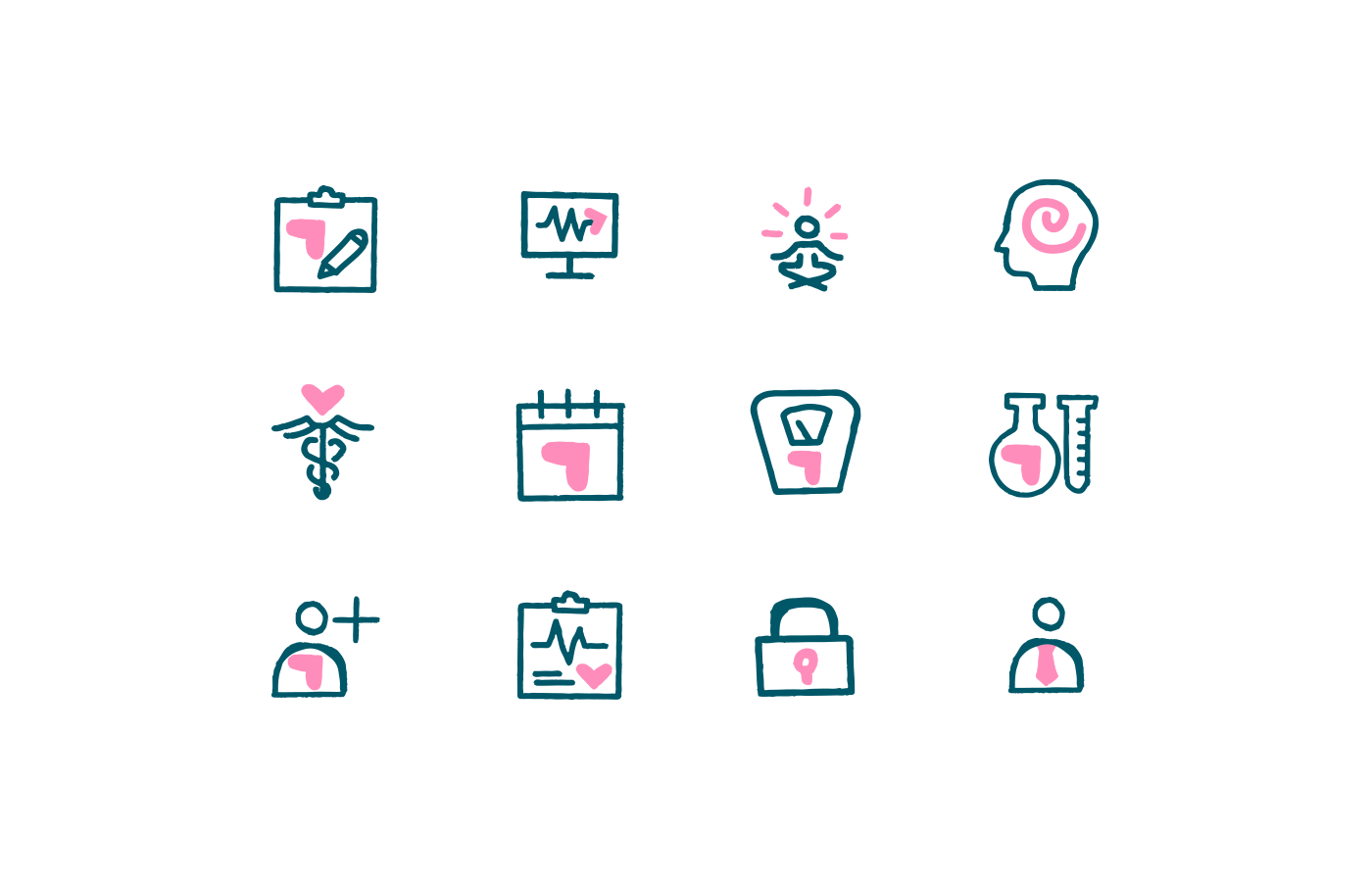
The colour palette uses a light pink, differentiating from competitors by drifting away from the typical cold blues and greens and bringing kindness and a welcoming spirit to the brand. We also developed a visual system of dynamic illustrations and icons based on an aeronautics control centre, embracing the analogy of the big idea.
A people-centric message
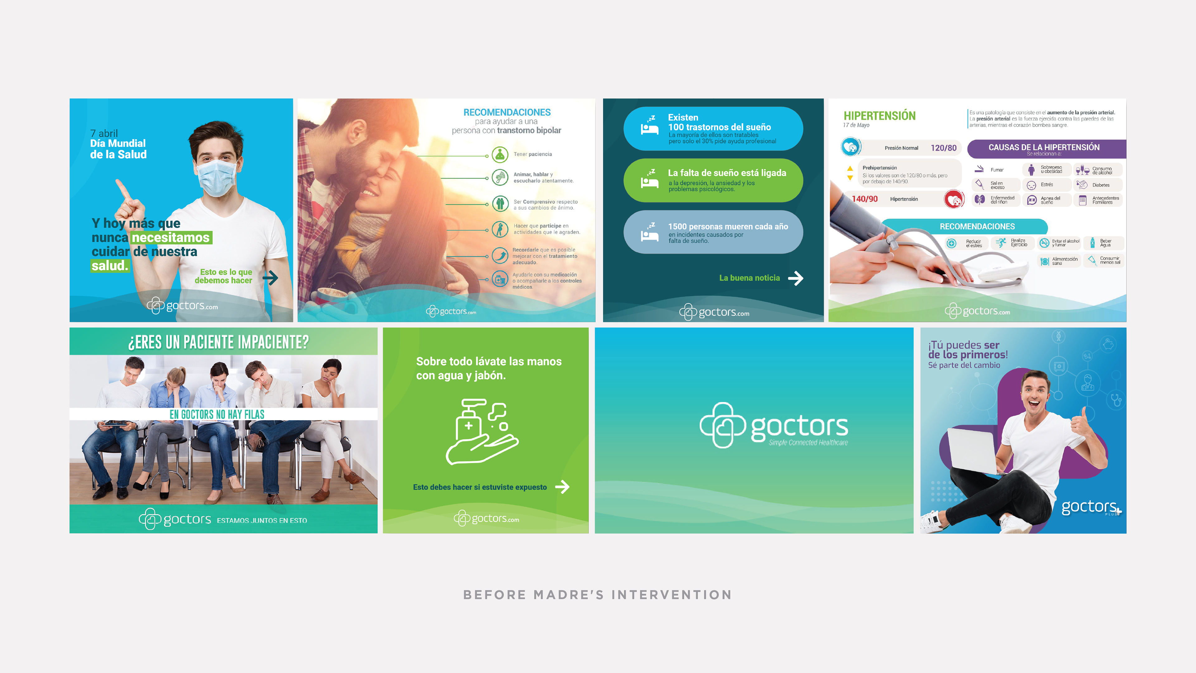
We shifted the brand messaging to directly address the real and practical consumer pain points like not having all their medical history at hand or constantly filling out paperwork. We also avoided projecting the brand as the hero, as the real heroes are the users. Simply put, we put the patient at the centre of it all.
To further differentiate the brand, we embraced the product's intricacy. While most competitors sell themselves as an "easy" solution, the Goctors system is inevitably complex, and that's fine, as it is the most complete in its market.
Creative and Strategic Direction: Carlos Zúñiga, Amanda Cuadra.
Project Coordination: Karen Torres
Lead Designer: Andrea López
UX/UI Design: Inti Ruíz, Eugenia Lacayo.
Copy and Communications: Jonathan Picado, Nicole Brener.
Developed by Madre Consulting for Goctors © 2021
Project Coordination: Karen Torres
Lead Designer: Andrea López
UX/UI Design: Inti Ruíz, Eugenia Lacayo.
Copy and Communications: Jonathan Picado, Nicole Brener.
Developed by Madre Consulting for Goctors © 2021