STRATEGY, BRANDING, DESIGN
Acton Academy Nicaragua: Designing a bold education brand that scales
How do you launch a school that breaks every traditional rule and still earn parents’ trust from day one?
The opportunity was bold, but the context was conservative. Nicaragua’s education market is among the most traditional in Latin America. For families used to uniforms, homework, and lectures, Acton’s promise, where every child finds a calling that can change the world, sounded almost too good to be true.
Branding a movement, not just a campus
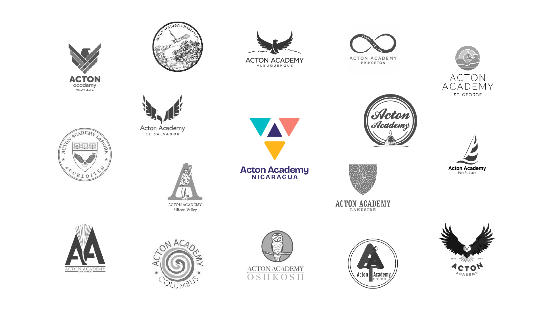
Most Acton schools operate independently with minimal brand guidance. Beyond a wordmark and primary color, there was little consistency across the network. That lack of structure led to fragmentation and missed opportunities to build brand equity for the movement as a whole.
Our client in Nicaragua wanted to change that. This wasn’t just about creating a great brand for one school. It was about building a system that any Acton, anywhere in the world, could adopt if they wanted to. It needed to be flexible enough to allow local stories and visuals, while still holding together as one recognizable global identity.
Clarifying the offer and positioning
We began with a strategy sprint to align all stakeholders and define the foundation of the brand.
Who are we speaking to? We mapped the motivations and concerns of key audiences: parents, learners, and potential guides.
What makes this different? We positioned Acton not as an alternative to traditional schools, but as a purpose-driven path where children become the heroes of their own journeys.
How do we connect with local culture while still standing out? We built messaging principles that could balance local relevance with the clarity of a shared vision.
Our goal was to develop a brand that felt bold, trustworthy, and emotionally resonant: an identity that would invite curiosity while communicating professional credibility.
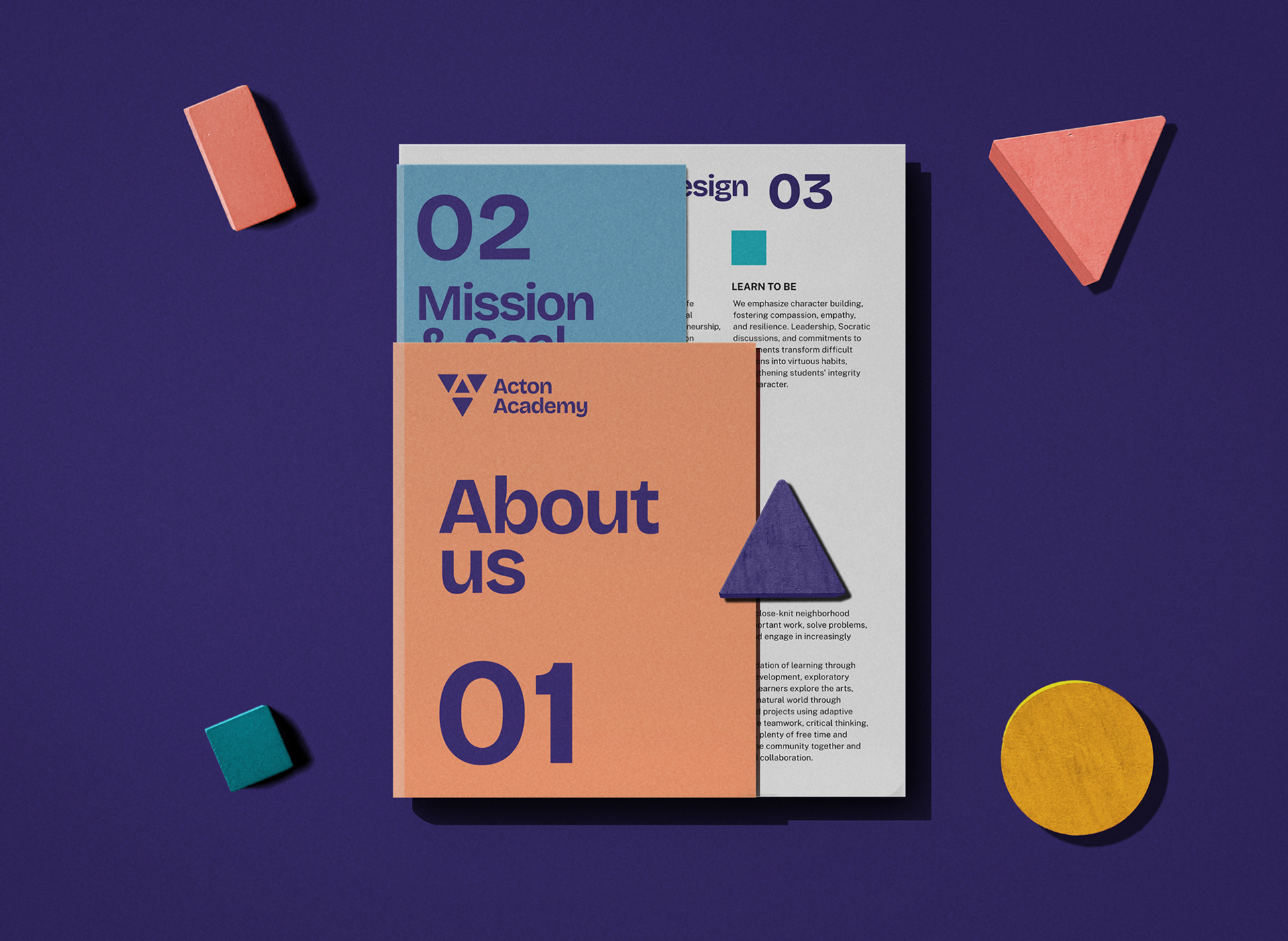
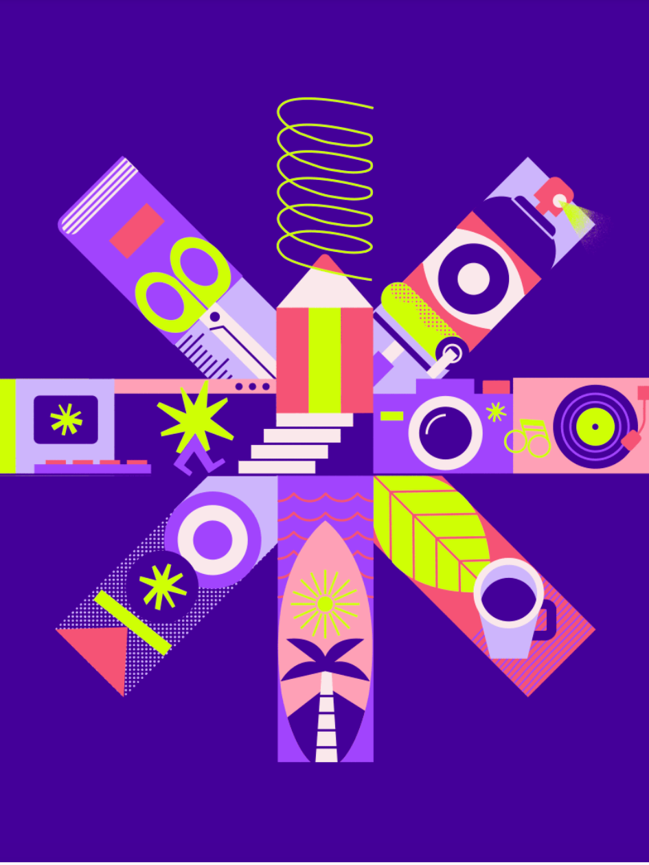
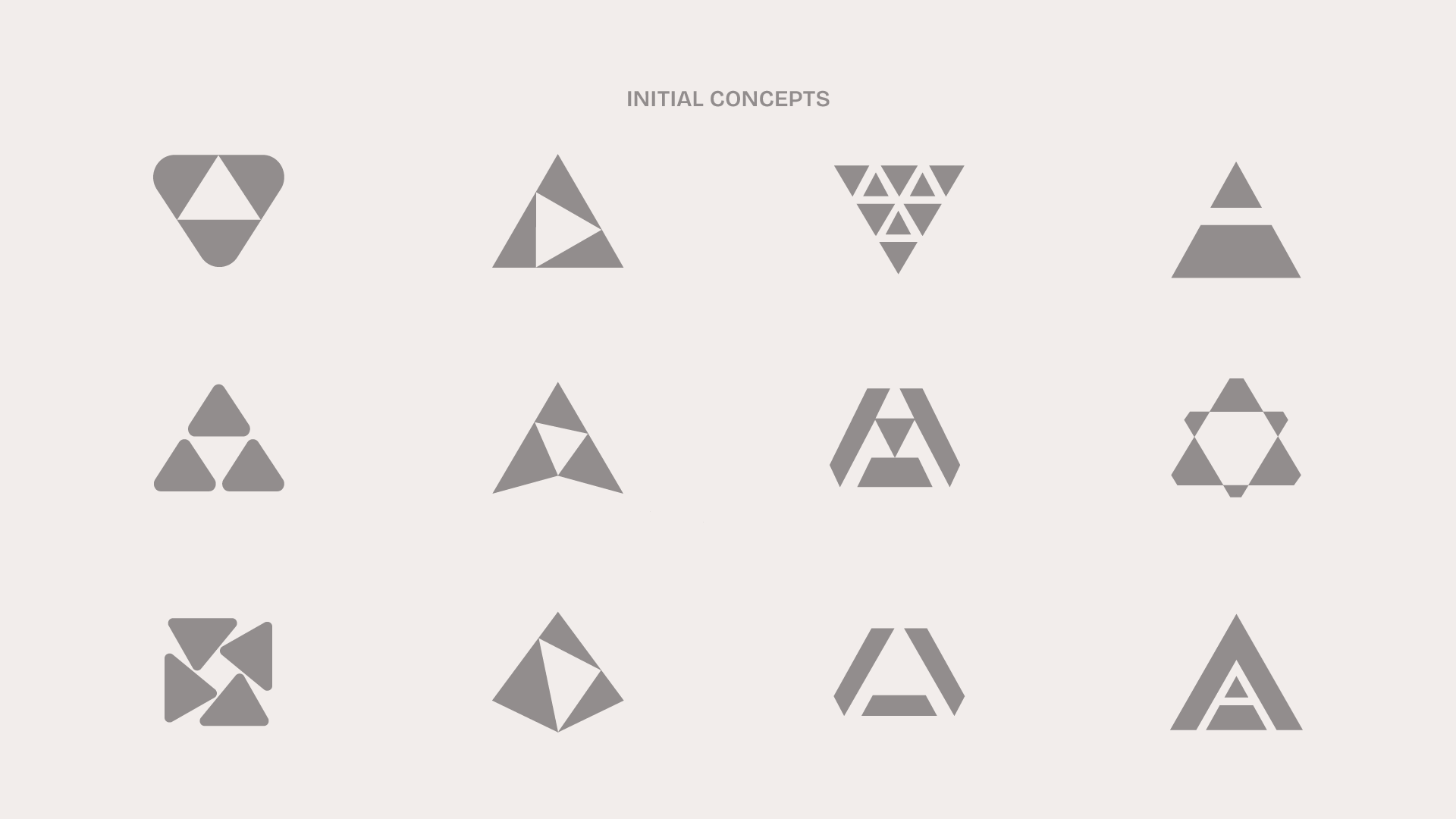
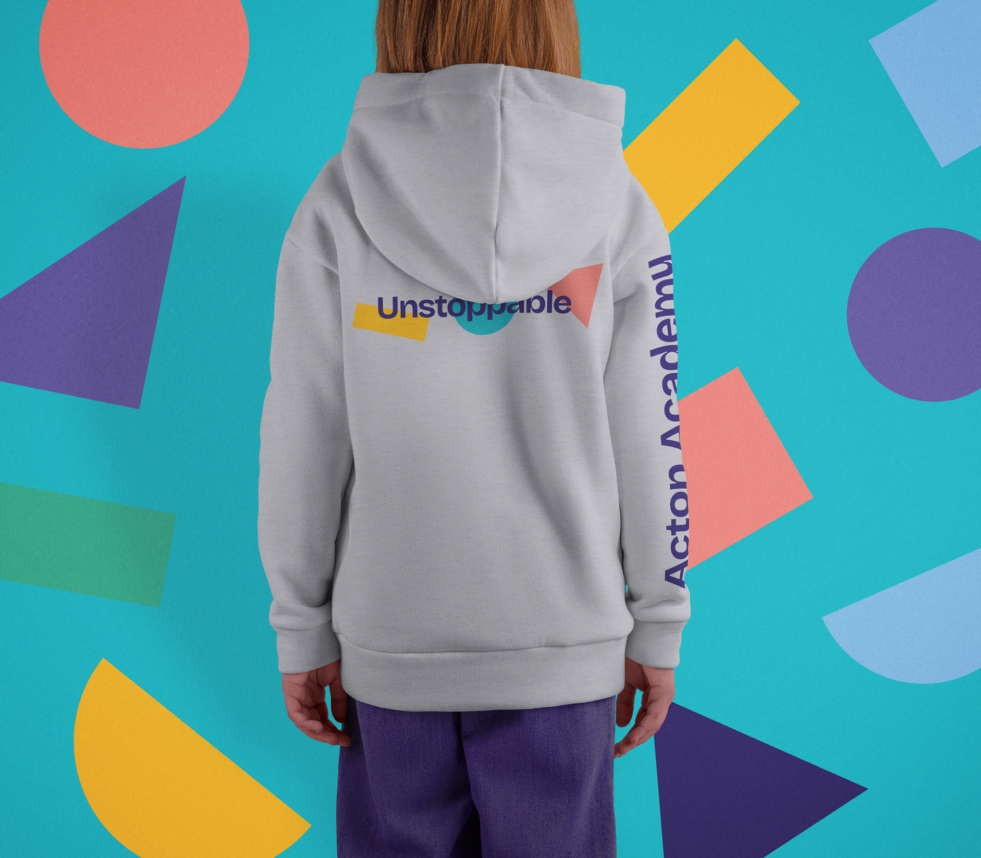
Designing a scalable, flexible, and inspiring identity
With the strategy in place, we created a full visual identity system rooted in Acton’s values and designed for real-world application and global scalability.
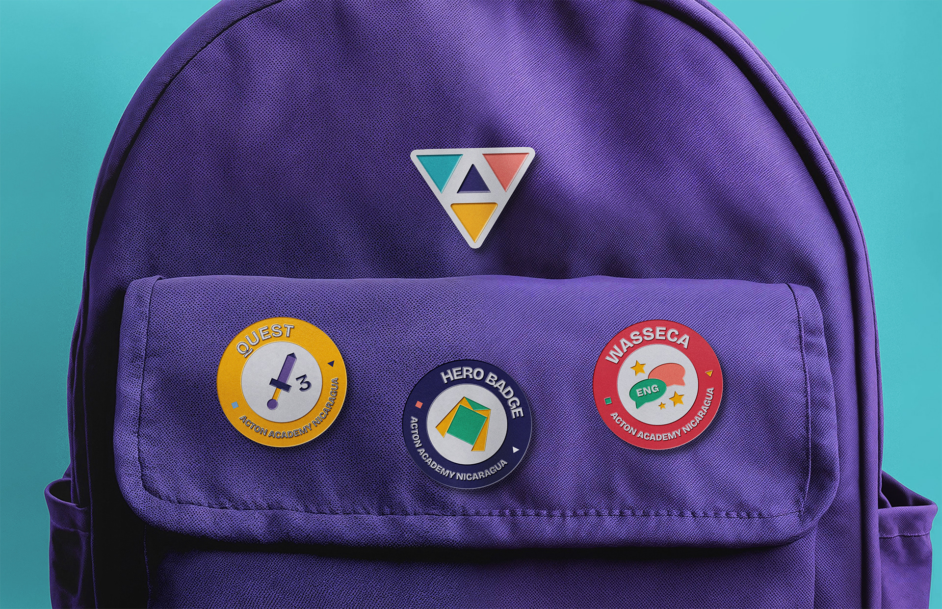
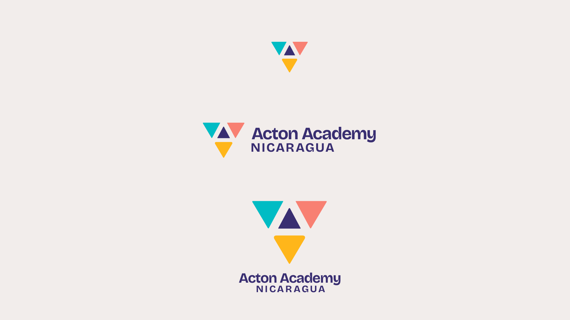
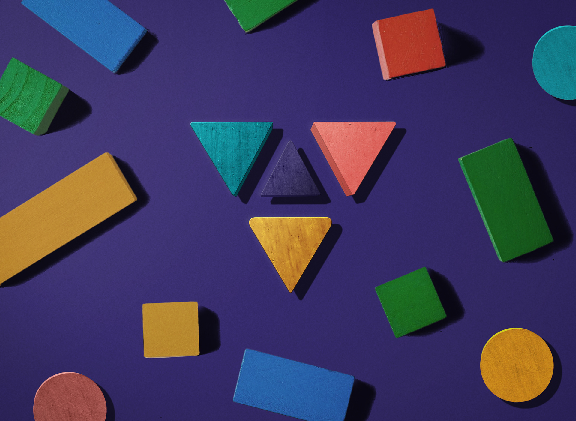
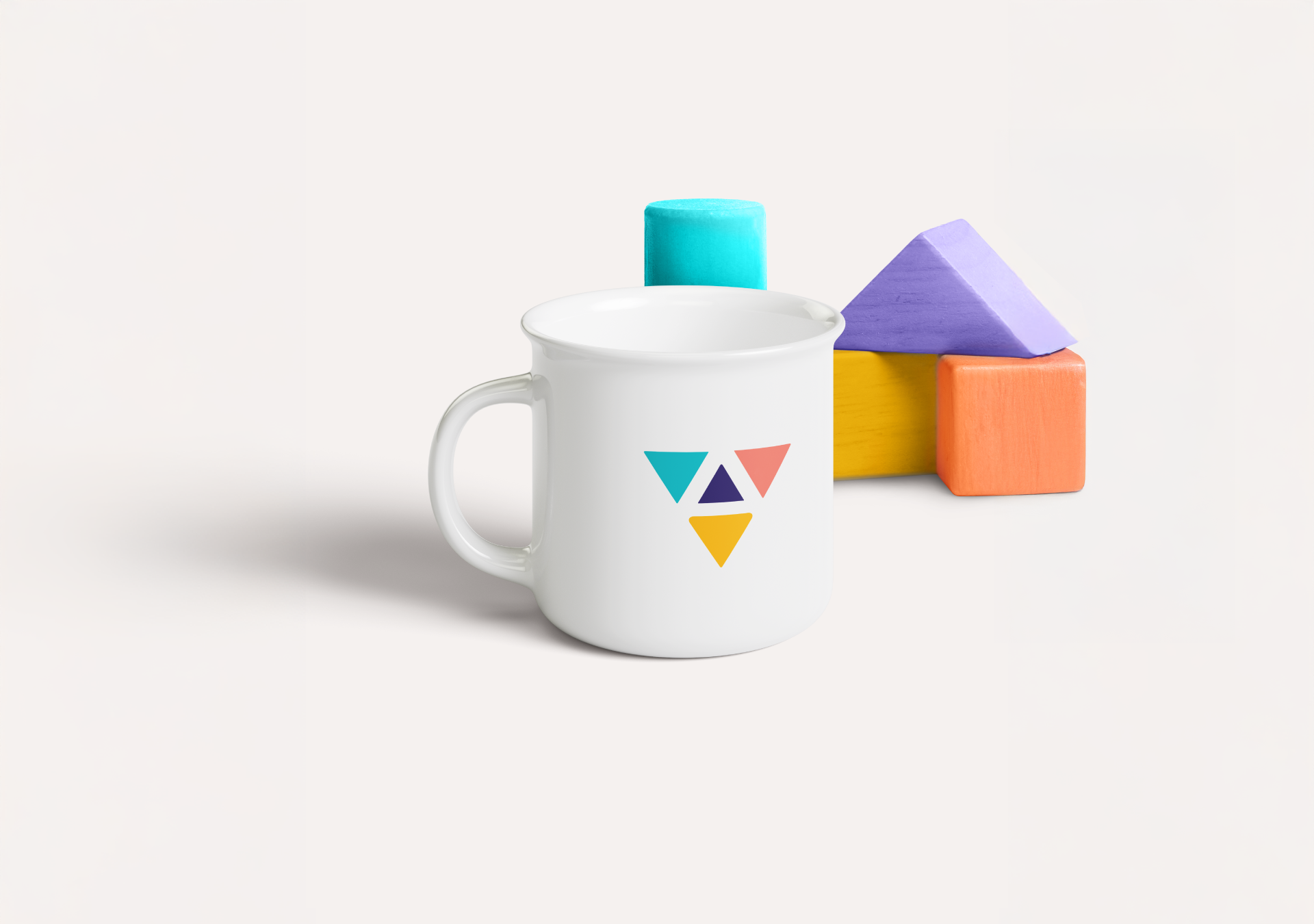
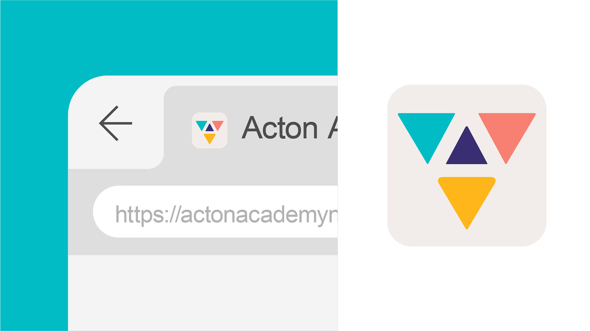
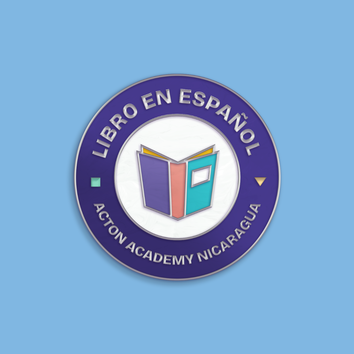
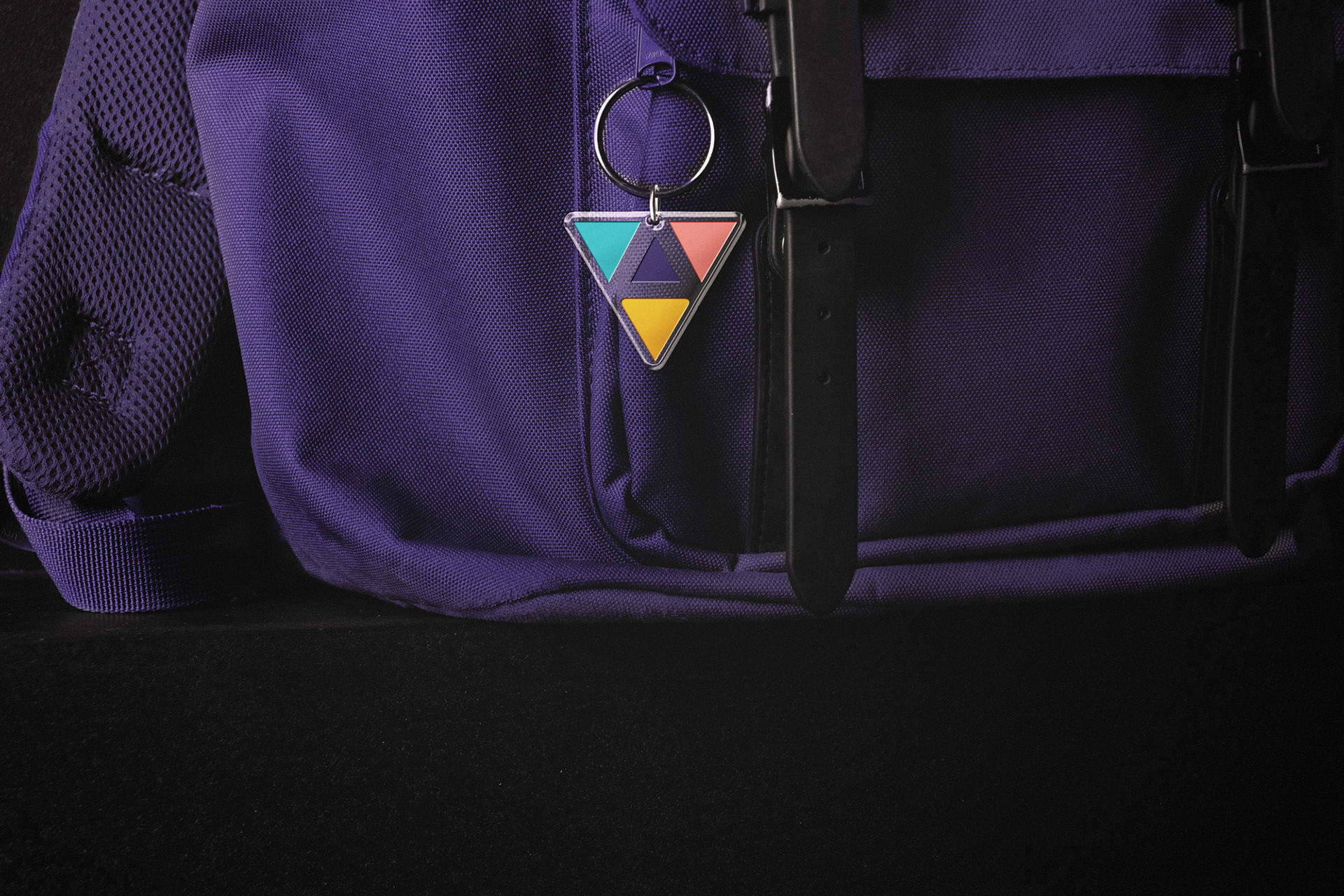
Logo: A modular geometric “A” built from three distinct triangles, each symbolizing one of Acton’s core pillars: Learn to Be, Learn to Learn, and Learn to Do. It’s simple, memorable, and adaptable across formats and platforms.
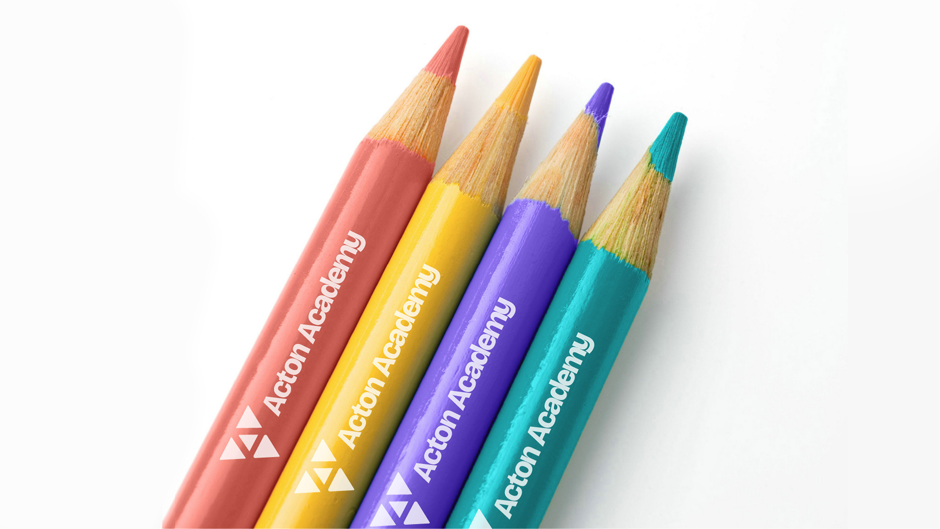
Color System: We introduced a vibrant purple, distinct from the typical navy blues of academic branding, to signal innovation, confidence, and warmth.
Typography & Visual Language: Clean, modern typefaces, flexible grid systems, and layout templates help bring consistency across every application, from classroom materials to social posts.
Brand Toolkit: We developed a full library of brand assets, including icons, animations, illustrations, photo treatments, and templates. Everything was designed with usability in mind, so schools could adopt and customize as needed without a design team.
Every decision reinforced the core idea: build a system that any Acton could use, adapt, and make their own.
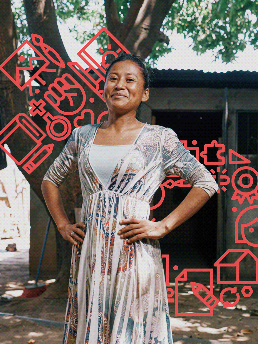
Earning trust, sparking recognition
The brand launched in Nicaragua with just six students, but the clarity and professionalism of the identity helped position Acton as a credible institution from the start.
Despite the lack of formal accreditation or a large marketing budget, the school filled its founding cohort and began building a community. Parents responded to the bold visual system, and the brand’s ability to clearly communicate what makes Acton different opened doors for workshops, events, and word-of-mouth momentum.
Importantly, the system is scalable. Other Acton schools around the world could adopt this framework while still reflecting their local culture, allowing the global network to grow stronger together without sacrificing individuality.

2025 © Madre Consulting for Acton Academy Nicaragua
Creative Direction: Carlos Zúñiga
Creative Direction: Carlos Zúñiga
Strategy Direction: Carlos Zúñiga, Amanda Cuadra
Project Coordination: Karen Torres, Mariana Rivas
Design team: Carlos Zúñiga, Dainin Solís, Inti Ruiz, Capeto Carrión, Ulises Rodríguez
Project Coordination: Karen Torres, Mariana Rivas
Design team: Carlos Zúñiga, Dainin Solís, Inti Ruiz, Capeto Carrión, Ulises Rodríguez
Copywriting: Carlos Zúñiga, Amanda Cuadra
Production for case: Daniel Aragón, Capeto Carrión, Dainin Solís